Data & Dashboards
M&E Dashboards for NGOs: From Field Data to Live Decision-Making
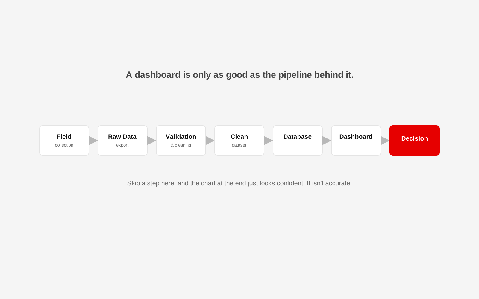
Collecting data is often the easiest part of monitoring and evaluation. The harder part begins after the forms are submitted.
A programme team may have hundreds or thousands of records sitting in a mobile data collection tool. Some fields are inconsistent. Location names are written in different ways. Dates are missing. The same participant may appear twice. Programme managers want a dashboard. Donors want the monthly numbers. Field staff want corrections reflected quickly.
The temptation is to connect the form directly to a chart and call it a dashboard. That is usually where the problems begin. A useful M&E dashboard depends on the pipeline behind it.
Start with the decisions, not the charts
Before deciding what the dashboard should look like, ask what decisions it needs to support. A programme manager may need to know whether activities are on target. A field coordinator may need to see which locations have missing submissions. Leadership may need a small set of outcome indicators. A donor report may require period-based figures and evidence of geographic reach. If every available field is turned into a chart, the result is not better monitoring, it is a crowded screen. Start with a short list of questions the dashboard should answer.
Design the form with analysis in mind
Data quality begins before fieldwork. A well-designed digital data collection form should use clear field names, appropriate validation, controlled choices where possible and consistent location structures. If field workers type village names into a free-text box, the dataset may contain several spellings for the same place. The same principle applies to dates, programme codes, participant IDs and indicator categories. The best cleaning process is the one you do not need, because the data was collected consistently in the first place.
Keep the raw data unchanged
Do not make the exported spreadsheet your only working copy. Keep a raw layer that reflects what was originally collected. Corrections and transformations should happen in a separate processing layer, so the team has a reliable source to return to when something looks wrong later. For larger programmes, the clean data may live in a database rather than a spreadsheet.
Create repeatable cleaning rules
Manual spreadsheet cleaning may work for a one-time survey. It becomes risky when the same report is produced every month. Write the rules down:
- standardise location names;
- reject impossible dates;
- identify likely duplicate records;
- convert blank values consistently, and separate "zero" from "not reported";
- check that programme codes exist;
- flag values outside expected ranges.
Where possible, automate repeatable rules. Do not automatically "fix" ambiguous records. Flag them for review instead.
Add a data quality layer
A dashboard should not only show programme performance. It should also help the team understand whether the data can be trusted. Useful quality checks may include missing required fields, duplicate participant IDs, late submissions, unusually high or low values, locations with no recent data, and records awaiting verification. This matters especially when leadership sees polished charts: a clean visual can make weak data look more certain than it really is.
Define indicators once
Teams often lose time because different people calculate the same indicator differently. Create an indicator dictionary. For each indicator, document its name, definition, unit, numerator and denominator where relevant, source, frequency, disaggregation, owner and exclusions or caveats. Then make the dashboard calculation follow that definition. This reduces arguments about numbers during reporting week. It is the same discipline behind a good baseline and endline survey design.
Build the dashboard around action
A useful dashboard should help someone notice something and decide what to do. A practical programme view might include target versus actual, the current reporting period, trend over time, location comparison, demographic or programme filters, data quality alerts, and the date of last refresh. Avoid decorative charts that do not change a decision. A one-page dashboard with five useful indicators is often better than fifteen pages of visualisation. It is the same principle behind good dashboard design generally, not just in an NGO context.
Decide how fresh the data needs to be
"Live dashboard" can mean different things. Some programmes need updates within minutes. Others only need a daily or weekly refresh. Real-time infrastructure adds complexity, so do not build it unless the decision-making process actually needs it. Ask how often the source data changes and how quickly someone acts on the result.
Control access
Programme data may include personal or sensitive information. Do not put raw participant-level data into a dashboard simply because it is available. Separate operational views from leadership or public views, use role-based access where needed, limit personally identifiable information, and keep an audit trail for sensitive changes. Privacy and legal requirements should be reviewed with the organisation's qualified compliance or legal advisers; the technical system should implement the approved rules.
A simple architecture for a small programme
For a small team, the pipeline may be modest: a scheduled export or API from the data collection platform, a validation script, a clean table, then a BI layer such as Looker Studio. For a larger programme, that grows into an ingestion service, a raw database, transformation and validation, an analytics database, a BI dashboard and role-based access. The right architecture depends on data volume, sensitivity, reporting frequency and internal capacity.
The dashboard is not the monitoring system
A dashboard is only the visible part. The monitoring system includes the questions being asked, how data is collected, who checks it, how indicators are defined, how corrections happen and what decisions follow. When those parts are weak, a prettier dashboard will not fix them. Once the pipeline is solid, that same data is also what makes a credible donor-facing impact report possible.
If reporting week begins with copying numbers between spreadsheets, the dashboard is not the first thing to fix
Studio 1947 works across field research, data cleaning, analysis, database design and dashboards, informed directly by field research and survey collaboration we've run ourselves. See our Data, Design & Tech work, or talk to us about your M&E data.