Design & Communication
Impact Report Design: How to Turn Research and Data into Reports Donors Actually Read
Many organisations have strong evidence and weak reports. The research may be careful. The programme data may be useful. The field stories may be powerful. But the final report arrives as a long document with dense paragraphs, screenshots of charts and important findings buried deep inside.
The problem is not always the research. It is often the translation from evidence to communication. An impact report should help a reader understand what happened, why it matters and what should happen next.
Decide who needs to use the report
Before designing pages, identify the audiences: funders, programme leadership, field teams, government partners, researchers, communities, journalists, prospective partners. They will not all read the document the same way. A funder may want the headline outcomes and methodology. A programme manager may want location-level findings. A researcher may want definitions and limitations. A journalist may need verified facts quickly. Design the report so each reader can find the level of detail they need.
Start with the message, not the template
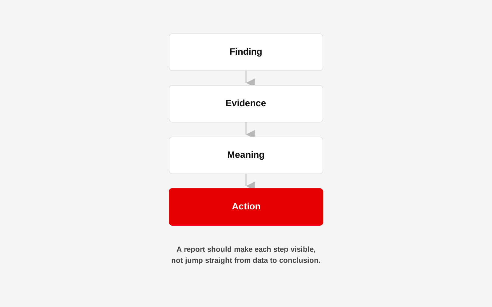
A report should not begin with a choice of colours and page size. Begin with three questions: what did we set out to learn or change, what does the evidence show, and what should the reader understand or do because of it. That becomes the narrative spine, and the design should make that structure easier to see.
Give the executive summary real work to do
An executive summary should not be a compressed copy of every section. It should tell a busy reader what the programme or study was, where and when it happened, who it involved, the most important findings, major limitations, and the key implications or recommendations. If the reader only sees two pages, those pages should still be useful.
Build charts around questions
A chart should answer something. Instead of asking, "Which chart looks good here?", ask, "What comparison does the reader need to see?" A bar chart may work for comparing locations. A line may work for change over time. A small table may be clearer than either when exact values matter. Do not turn every number into a chart, and do not use a pie chart simply because the data adds to 100 percent. The visual form should follow the question.
Give every number context
"75 percent improved" is not enough. Improved compared with what? Over what period? How many people were measured? Were there missing responses? Where space allows, add the context close to the chart rather than hiding it in a distant appendix. This makes the report more honest and easier to interpret. It is the same discipline that keeps an ongoing monitoring dashboard trustworthy once the report itself is out the door.
Use stories as evidence with care
A participant story can make programme work understandable in a way a table cannot, but one story should not be presented as proof that an outcome happened everywhere. Use stories to show lived experience, process or complexity, and use the wider evidence to support broader claims. Photography and personal stories should follow informed consent, dignity and safeguarding practices approved by the organisation.
Separate finding from interpretation
A useful report makes it clear when it is describing data and when it is explaining what the data may mean. For example:
- Finding: attendance fell during a particular month.
- Interpretation: field notes suggest seasonal work may have affected participation.
Those are not the same statement. Keeping them distinct makes the report more credible.
Show limitations without hiding them
Limitations are not an admission that the project failed. They tell the reader how confidently to interpret the evidence. A useful limitations section may cover incomplete records, sample constraints, changes in field conditions, respondent bias, inconsistent historic data, external events and gaps in comparison data. These are the same limitations a careful baseline and endline study should already be tracking. Clear limitations build trust with serious readers.
Create visual hierarchy before decoration
A reader should be able to skim the report and understand its structure. Use consistent levels for section title, key finding, supporting evidence, chart, caption, source and recommendation. Good hierarchy reduces effort, and it also makes a long report feel shorter because the reader knows where they are.
Design charts and tables as one system
Reports often look inconsistent because charts arrive from different spreadsheets and people. Create rules for typography, number formatting, labels, units, legends, colours, source notes, chart titles and missing data. The goal is not visual uniformity for its own sake. It is to make interpretation predictable. This is the same discipline Studio 1947 brought to the Friedrich Ebert Stiftung India publication work, where dense research had to hold together as one visual system across many pages.
Make the digital report accessible
A PDF may be the final deliverable, but it should still be usable: reading order, searchable text, tagged headings where possible, meaningful links, alt text for important graphics, sufficient contrast, charts that do not rely on colour alone, readable text size and sensible file size. For major reports, an HTML summary page can improve accessibility, discovery and sharing.
Think beyond the final PDF
The same evidence may need to travel into a donor presentation, a dashboard, a social media series, a one-page brief, a website impact page, a board update or a community feedback session. Designing the information system once makes these later formats easier. That is one reason Studio 1947 treats research, data visualisation and communication as connected work rather than separate hand-offs.
If the evidence matters, the way it is communicated matters too
Studio 1947 works with research, programme data and complex material to turn findings into reports, visual systems and communication that people can understand and use. See our Communication & Campaign and Data, Design & Tech work, or discuss your report or data story.