Data & Dashboards
Dashboard Design That Drives Decisions: What to Show, What to Hide, and What to Measure
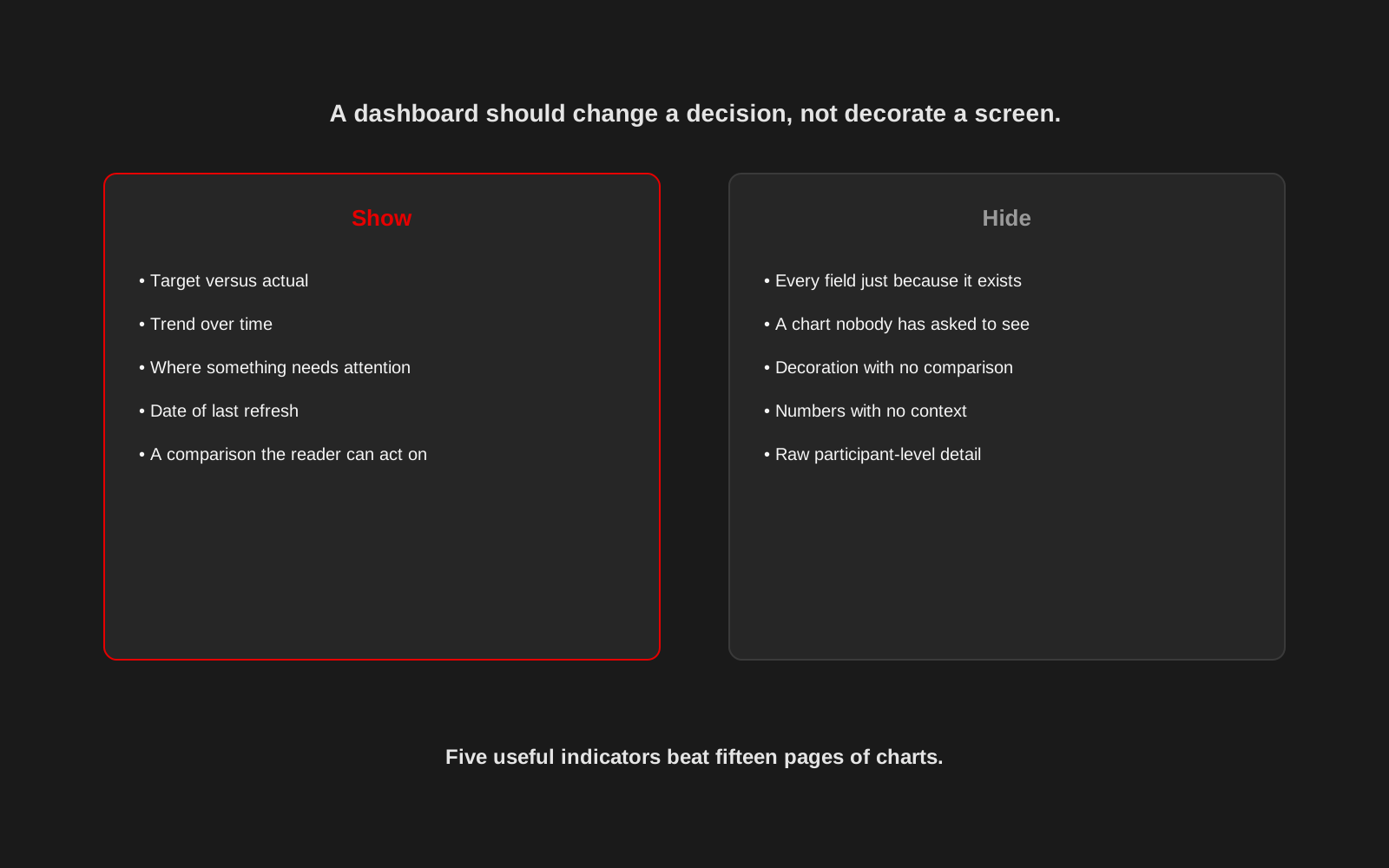
Most bad dashboards are not badly designed. They are just trying to show everything, which means they end up helping with nothing in particular.
A dashboard is not a report of everything the organisation could measure. It is a tool for one job: helping a specific person notice something and decide what to do about it. Every screen should be built around that job, not around whatever data happened to be easiest to connect.
Start with the decision, not the data
Before choosing a single chart, ask what decision this screen needs to support and who is making it. A field coordinator deciding where to focus this week needs something different from a leadership team reviewing quarterly performance. A dashboard trying to serve both audiences at once usually serves neither well.
Show comparisons, not just numbers
"340 this month" tells the reader almost nothing on its own. Target versus actual, this period versus last, this location versus another, these comparisons are what let someone judge whether 340 is good, bad or unremarkable. A number without a comparison is decoration.
Trend matters more than a single snapshot
A single data point can be a fluke. A trend line shows whether something is genuinely improving, declining or holding steady, and that is usually closer to what the decision actually depends on. Where volume allows, favour the line over the isolated figure.
Hide what does not change a decision
Every field a database can produce is a candidate for a chart, and that is exactly the problem. A useful dashboard leaves out anything that would not change what the reader does next, however interesting it might be to look at. If nobody can say what action a chart supports, it probably does not belong on the main view.
Make data quality visible, not assumed
A confident-looking chart built on a handful of unverified records can be more dangerous than an empty one, because it invites a decision the data cannot actually support. A small note on sample size, last refresh date, or missing submissions costs little space and prevents a lot of false confidence.
Match the chart to the question, not the other way round
A bar chart usually compares categories well. A line suits change over time. A small table can be clearer than either when exact values matter more than the shape of a trend. Choosing a chart type because it looks impressive, rather than because it answers the question, is one of the most common ways a dashboard becomes decoration.
Filters are a feature, not a decoration either
A dashboard used by different locations, programmes or teams should let each person narrow the view to what they are actually responsible for, rather than making everyone scroll past data that is not theirs. A well-placed filter often does more for usability than another chart would.
Protect sensitive data by design, not by hoping nobody looks
Not every dashboard should show raw, individually identifiable data simply because it exists in the underlying system. Separate operational views from leadership or public ones, and keep sensitive detail behind proper access controls rather than trusting that nobody will scroll to the wrong tab.
Five useful indicators beat fifteen pages of charts
Studio 1947 has built exactly this kind of focused, decision-first dashboard for real operations, including the Radha Madhav pharmacy dashboard, and packaged similar thinking into products like the Inventory & Sales Dashboard. The discipline is the same whether the audience is a pharmacy owner or an NGO programme team watching an M&E dashboard: fewer, sharper views built around what someone actually needs to decide.
Build the dashboard around the decision it needs to support
Studio 1947 works across data, design and technology to build dashboards people actually use to decide something, not just look at. See our Data, Design & Tech work, or talk to us about your dashboard.