Web & Digital Products
How to Plan a Website Redesign: A Practical Guide for NGOs, Colleges & Growing Organisations
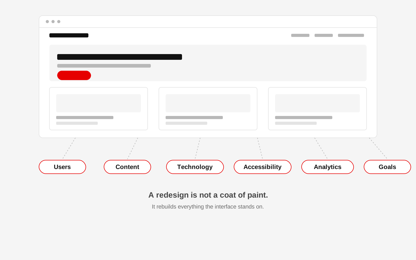
A website redesign usually begins with a feeling. The website looks old. It is difficult to update. Important information is buried. People keep asking questions the website is supposed to answer. The organisation has changed, but the website still represents what it was three or five years ago.
That is usually when someone says, "We need a new website." They may be right. But the first question should not be what the new website will look like. The better question is this: what does the organisation need the website to do now that the current website cannot do well?
A useful redesign starts there. For an NGO, this might mean helping donors understand impact while also making services easy to find for people who need support. For a college, it may mean clearer admissions information, better access to notices and a system staff can update without calling a developer. A redesign is not only a visual exercise. It is a chance to rethink how information is organised, how people move through the site, and how the website supports the organisation behind it.
Start with the reason for the redesign
"We want a modern website" is not a useful brief on its own. Try to make the problem specific. A redesign may be needed because visitors cannot find important information, the organisation has added programmes or locations, staff struggle to update the site, forms do not work properly, the mobile experience is poor, or the technology is difficult to maintain.
A useful exercise is to ask several people inside the organisation to complete one sentence separately:
Our current website makes it difficult to __________.
Compare the answers. The differences are often more useful than a discussion about colours or visual references.
Identify who the website is actually for
Many organisations say their website is for "everyone." That usually makes it harder for everyone. An NGO may need to serve beneficiaries, donors, partners, volunteers and job applicants, and those people do not arrive with the same question. That is the practical detail behind planning an NGO website redesign specifically. A donor may want evidence of impact and governance; a person looking for support may need a phone number immediately.
Design around these tasks rather than broad demographic labels. Instead of saying, "Our audience is students aged 18 to 24," say, "A prospective student needs to find eligibility, fees, important dates and the application process." That is much easier to design and test. When Studio 1947 rebuilt the Jan Sahas Social Empowerment Society website, the brief came from exactly this kind of task list: the organisation's mental health, women's livelihood and migrant resilience work had to be findable by very different visitors on the same site, not folded into one generic "About Us" page.
Audit the current website before deleting anything
Starting with a blank canvas feels exciting, but it can destroy useful content and search value. Before rebuilding, audit the current website from six angles.
Content
List the pages, reports, forms and resources already on the site. Decide what is accurate, what is outdated, what can be merged and what is missing. For long-running organisations, old publications and reports may be some of the most valuable material on the website.
Search and SEO
Find out which pages already receive search traffic. Identify useful URLs, backlinks and popular resources. Do not casually change or remove them. When a useful URL must change, map it to the most appropriate new page and use the correct redirect.
Technology
Document the content management system, hosting, forms, analytics, payments, databases and integrations already in use. A website that looks simple may support several important processes behind the scenes.
User experience
Test real tasks. Can someone find the annual report? Can a student find the admission notice? Can a donor understand how funds are used? Write down where people get stuck.
Accessibility
Check heading structure, colour contrast, keyboard use, form labels, alt text, link clarity and font size. Accessibility is not a final layer added after design. It affects whether people can use the website at all.
Performance
Test the site on an ordinary phone and a realistic network connection. A page that works perfectly on office broadband may still feel broken to the person it is meant to serve.
Decide what to keep before deciding what to build
A redesign does not mean everything must be replaced. Four decisions cover most of what a page needs:
- Keep: it works well and still has a clear purpose.
- Improve: it has value but needs better content, design or technology.
- Remove: it is outdated, duplicated or no longer useful.
- Build: the organisation now needs something the old site never had.
This stops teams from rebuilding useful things and from carrying old problems into a new interface.
Fix the information architecture before designing screens
Information architecture is simply the structure behind the website. It decides what belongs where and how people find it. A menu such as "About, Activities, Gallery, Publications, Media, Miscellaneous" may reflect internal filing habits, but it does not necessarily help a visitor. A structure such as "Who We Are, Our Work, Our Impact, Resources, Get Involved, Get Help" tells people more about what they can find.
The labels will be different for every organisation. The principle stays the same: organise around the needs of real users. A useful source of evidence is the questions people already ask by phone, email or WhatsApp. If the website should answer those questions but does not, the structure needs attention.
Get the content clear before finalising the visual design
A common redesign mistake is to approve beautiful empty screens and ask for content later. The content then arrives and does not fit the structure. Gather important material early: programme information, reports, team details, case studies, impact numbers and FAQs. Then decide what people actually need to understand. Content is part of the design. It should not be treated as material to pour into finished boxes.
Choose technology based on the organisation
There is no single correct technology for every website. The decision should consider who updates the website, how often content changes, what integrations are needed, security requirements, multilingual content. See multilingual website planning if more than one language is on the table, and internal technical capacity. Do not choose a stack because it is fashionable. Choose something the organisation can maintain and grow with. Studio 1947's bilingual campaign and website work for Walking Project in Mumbai is one example of how that choice follows the audience: the technology and content structure had to carry two languages cleanly, not bolt translation on afterwards.
Design for realistic devices and connections
A website should work for the people who actually use it, not only for the team approving it on a large monitor. Test ordinary Android devices. Test weaker networks. Compress images. Keep interactions purposeful. For organisations serving rural or low-connectivity communities, performance is part of accessibility.
Protect search visibility during the redesign
A redesign can improve SEO, but a careless migration can also remove years of accumulated search value. Before launch:
- map important old URLs to new ones;
- preserve useful content;
- use redirects where URLs change;
- carry over titles and metadata intentionally;
- check canonical tags;
- update internal links;
- submit the new sitemap;
- watch indexing and search traffic after launch.
Do not assume that a new design automatically means better search performance.
Test tasks, not just pages
Instead of asking whether the homepage looks good, ask whether people can complete important actions. Can someone find the annual report? Can a prospective student find admission requirements? Can someone looking for help find the correct service? Can staff publish a new notice themselves? A redesign succeeds when these journeys become easier.
Launch is the beginning of the next version
After launch, watch how the site is actually used. Look at search queries, popular landing pages, form completion, failed journeys and page speed. Improve what the evidence shows is weak. Studio 1947 works through a loop of understanding, designing, building and improving, and a website benefits from the same approach.
Refresh, redesign or rebuild?
- Branding feels slightly dated, structure still works: a refresh is usually enough.
- Navigation no longer makes sense, or new programmes have changed the organisation: that calls for a redesign.
- Staff cannot manage the CMS, or the site performs poorly on mobile: redesign or rebuild, depending on how deep the problem sits.
- The technology itself is unsupported or insecure: that is a rebuild, whatever the site looks like today.
There is no value in rebuilding a website simply because a new one sounds exciting. The useful question is whether the existing site still does the job the organisation now needs it to do.
Planning a redesign but not sure what actually needs rebuilding?
Studio 1947 works with organisations to understand the problem first, then shapes the information architecture, UX, content and technology around what the website needs to achieve. See how this plays out in practice in our Data, Design & Tech work, or start a conversation about your website.