Design & Communication
Design Systems for Growing Organisations: How to Keep Products, Websites and Campaigns Consistent
A small organisation can usually keep its visual identity consistent through habit. One or two people design everything, so the colours, type and tone stay close enough without anyone writing rules down.
That habit breaks as the organisation grows. More people touch the website, the app, the social posts and the print materials. A new hire copies an old file that was already inconsistent. Within a year, the logo appears in three slightly different colours and nobody remembers which one is correct.
A design system is a shared answer, not a style guide nobody opens
A style guide document tends to get written once and ignored. A design system works when it is closer to a shared toolkit: the actual colours, type styles, button shapes, spacing rules and components that people reuse, rather than a description of them. The easier it is to reuse the real thing, the less likely someone is to improvise a close-enough version.
Start with what already exists
Before inventing new rules, look at what is already in use across the website, the app, recent campaigns and printed material. Some of that inconsistency is accidental drift worth fixing. Some of it reflects a real difference in context, such as a campaign poster needing more visual energy than a form inside an app. A design system should account for the difference deliberately, not pretend it does not exist.
Tokens before templates
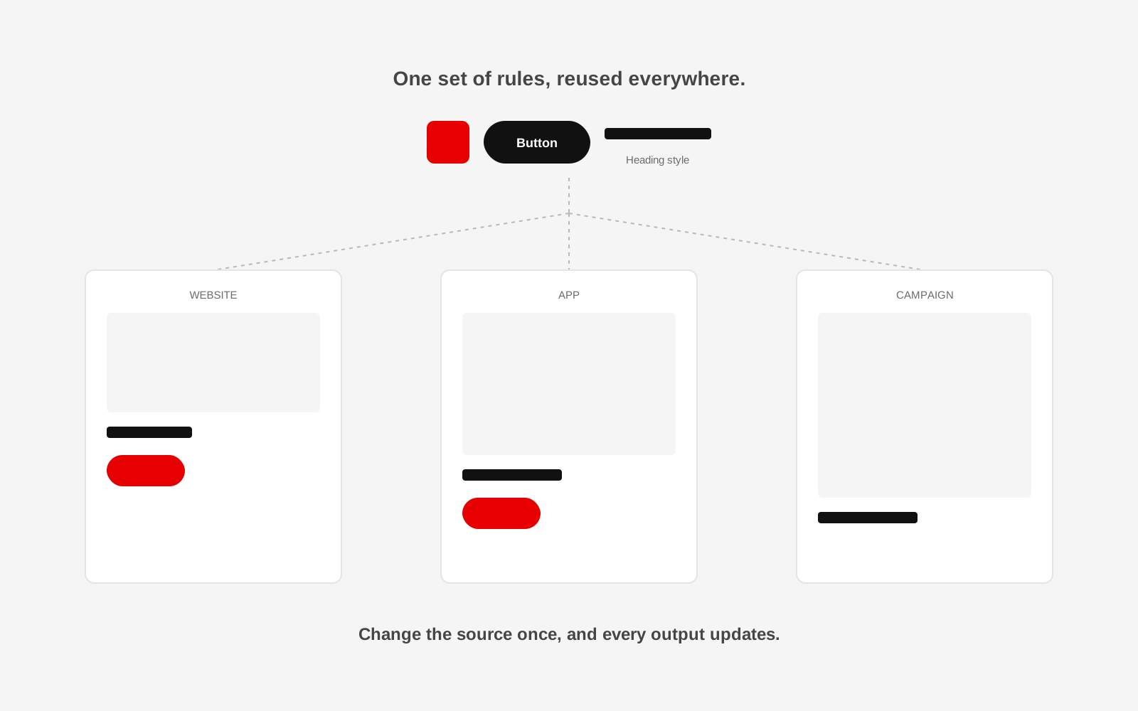
The smallest reusable pieces, a colour, a spacing unit, a type size, a border radius, matter more early on than a full library of finished page templates. When those small decisions are named and shared, a website, an app screen and a campaign asset can all pull from the same source without looking identical, and a change to the source updates everything downstream instead of requiring someone to hunt down every file.
Components should carry their own rules
A button component should already know its padding, its colours in different states, and roughly how wide it can get. If every person who places a button has to decide these things fresh, they will decide them differently. A well-built component makes the correct choice the easy choice.
Documentation is for the third person, not the first
The person who built the system rarely needs the documentation. It exists for the new designer, the marketing hire, or the outside vendor who joins six months later and needs to work inside the existing identity rather than invent their own. Keep it short, current and closer to "here is the actual file, use this" than a long explanation of design theory.
Consistency does not mean uniformity
A design system should make a campaign poster and a product screen feel like they belong to the same organisation, not force them to look identical. Studio 1947's brand work for Rajkamal Prakashan is a useful example: one identity, expressed consistently, still had room to flex across many languages, scripts and campaign moments without losing coherence.
Someone has to own it
A design system decays without an owner who can approve additions, resolve inconsistencies and say no to a one-off exception that would quietly become the new normal. It does not need to be a large team. It needs to be someone's clear responsibility.
Grow the system as the organisation grows
A five-page website does not need the same design system as an organisation running a product, a website and several active campaigns at once. Build what the current complexity actually needs, and expect to revisit it as more people, products and channels join.
Change the source once, and every output updates
Studio 1947 works across brand, product and campaign design to help growing organisations stay visually coherent as more people and projects touch their identity. See our Data, Design & Tech and Communication & Campaign work, or talk to us about your design consistency.