Rajkamal Prakashan

Rajkamal Prakashan is India's largest Hindi literary publisher. Studio 1947 worked with them on brand foundations, a digital product and a set of seasonal and festival campaigns, bringing one consistent visual language to their books, website and events.
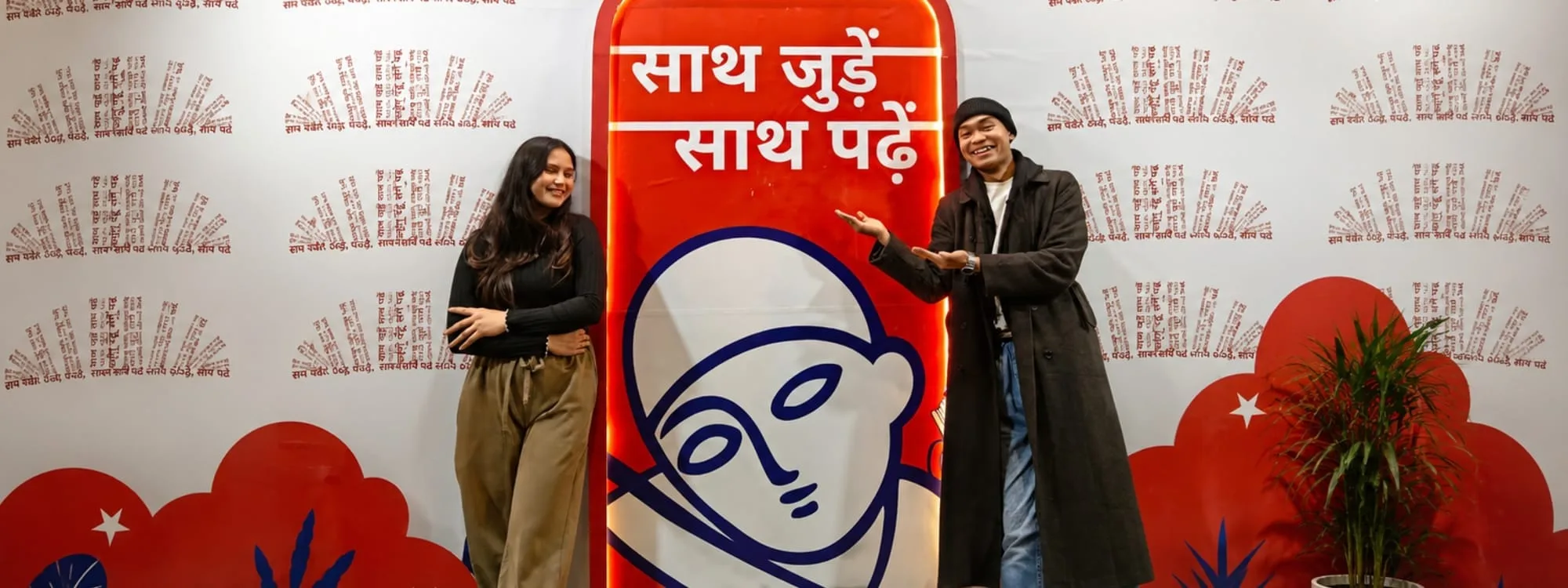
साथ जुड़ें, साथ पढ़ें
The central narrativeThis line already belonged to Rajkamal. It had lived quietly in the house for years, on a poster here, a bookmark there, but no one had said it out loud. Our job wasn't to invent a new line. It was to make this one loud.
One invitation, many tongues
India doesn't speak in one language. A reader in Patna reads in Hindi, another in Kolkata reads in Bangla, a third in Kochi reads in Malayalam, and for all three, a book means exactly the same thing.
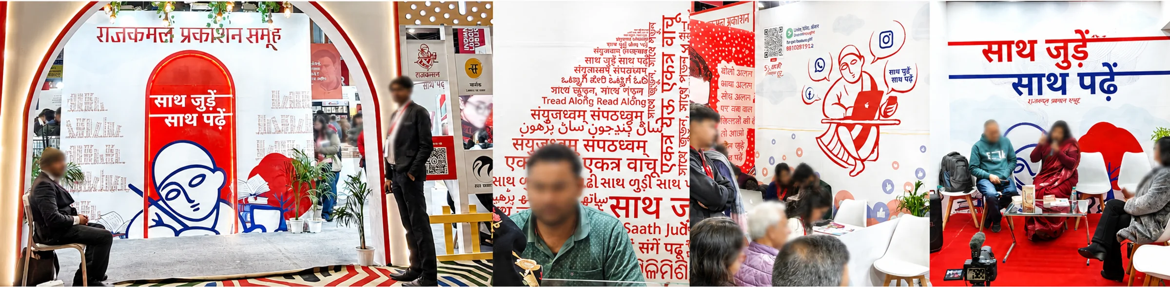
So the invitation couldn't stay in Hindi alone. साथ जुड़ें, साथ पढ़ें (Join together, read together) was said in every language it could be said in: সাথে জুড়ুন সাথে পড়ুন, ਸੰਗ ਜੁੜੋ ਸੰਗ ਪੜ੍ਹੋ, संयुज्धवम् संपठध्वम्, ஒன்றாகக் இணைவோம் ஒன்றாகப் படிப்போம், Tread Along Read Along, and many more.
And all of them sat inside one circle, with none placed above the others. A circle has no first line and no last. The design said exactly what the words did: coming together means coming as equals.

And the moment it goes big, red and unmissable, the meaning shifts. साथ जुड़ें, साथ पढ़ें stops reading like a tagline and starts reading like an invitation. Two verbs, both plural, both asking you to bring somebody along. A publisher that sells books becomes a community that reads together, and that is an entirely different thing.
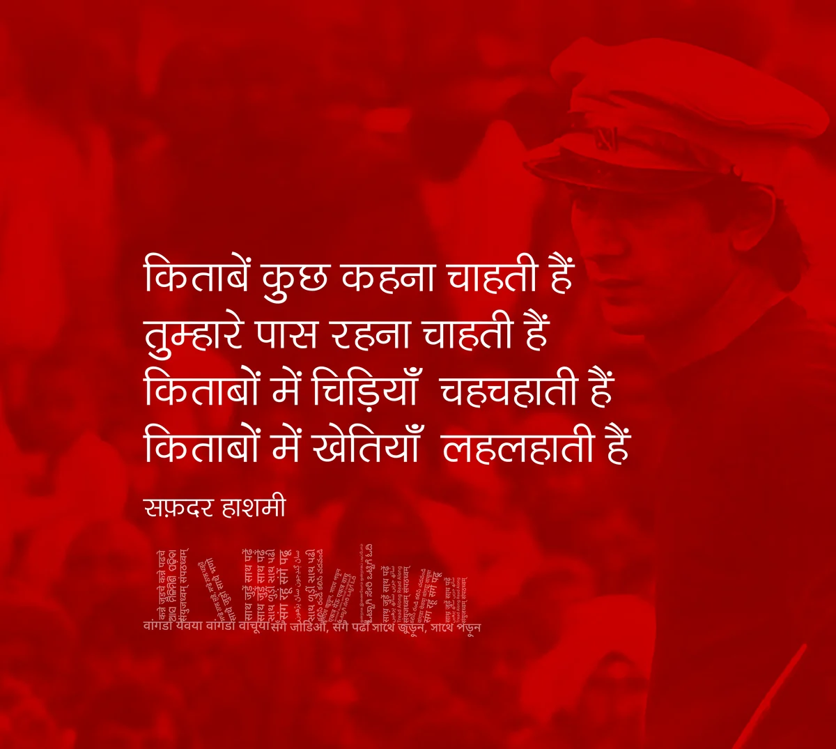
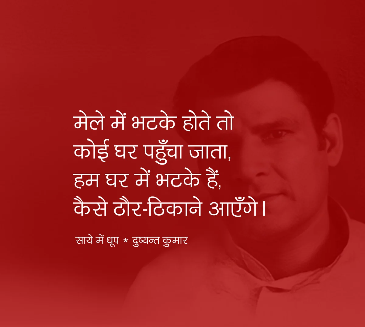
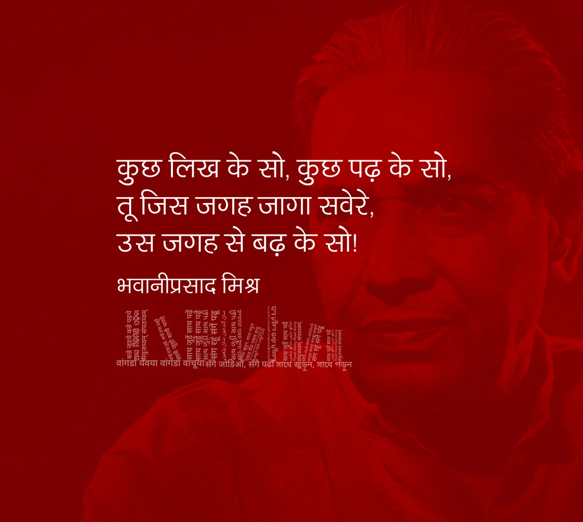
So we moved it from the corner of a poster to the centre of the system. The identity, the type, the digital product, the events calendar all carry the same idea. Whether the reader is holding a book, scrolling a feed, or standing in a launch hall, the invitation stays the same.
It also gave the brand a filter for what to say. If something brings readers closer to one another, it's in. If it only announces the publishing house, it stays out.
The loudest it has been so far was the 2026 National Book Festival in Delhi, where the line ran across the stall at full scale and did most of the talking for us.
The line in use
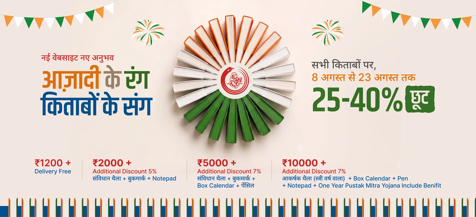
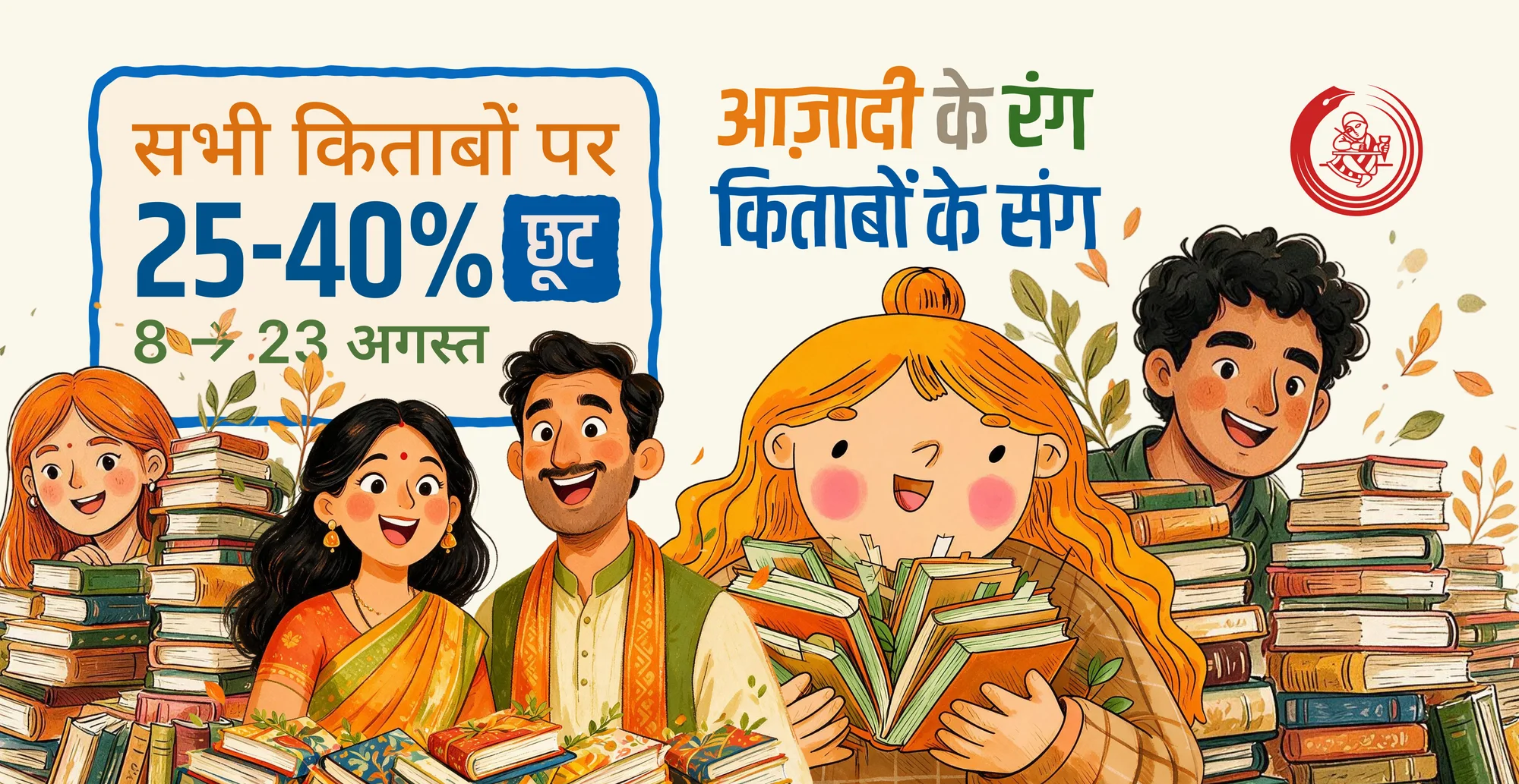
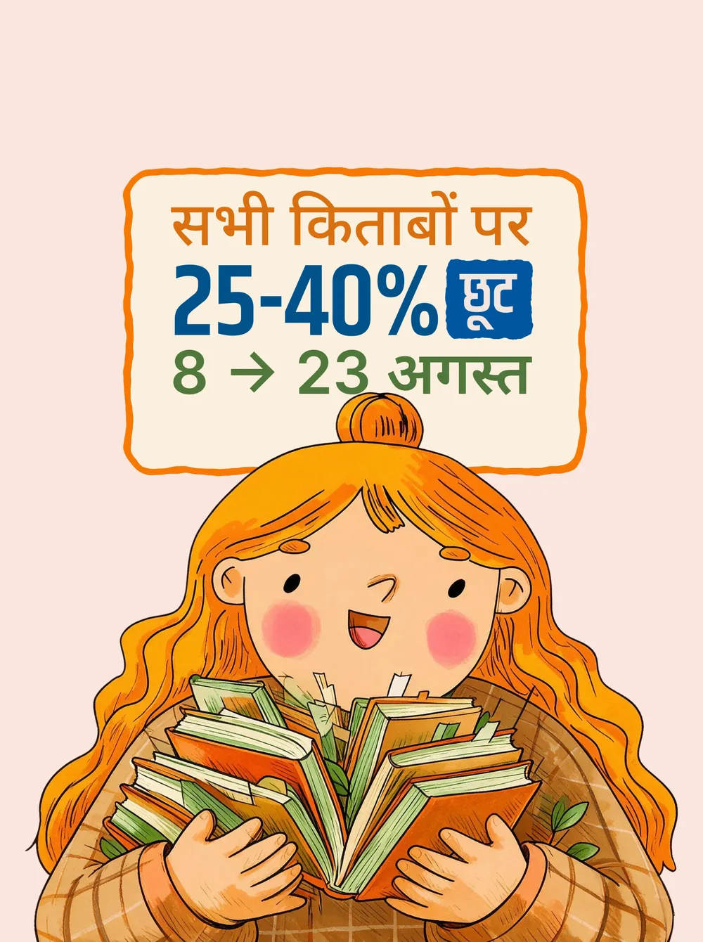
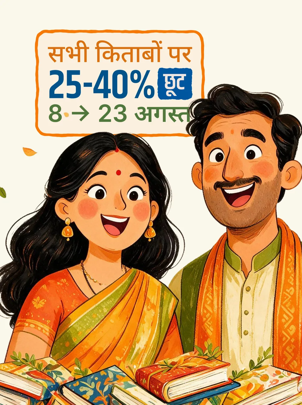
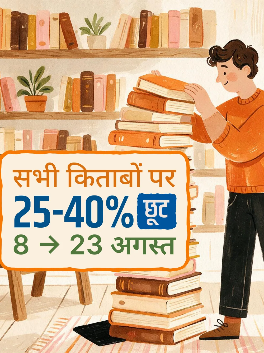
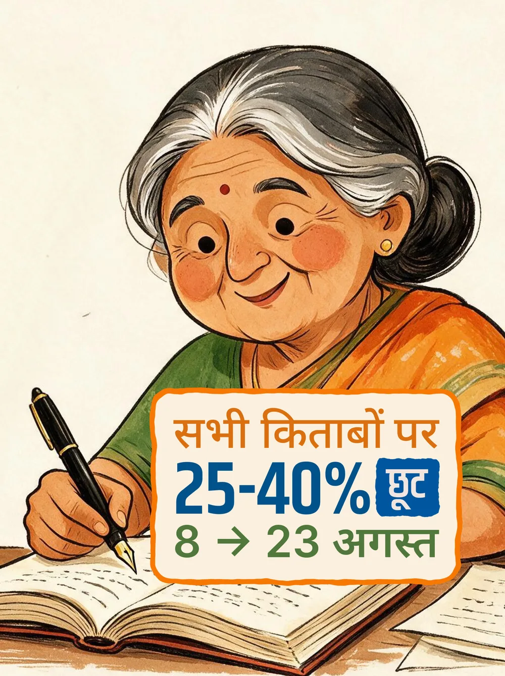
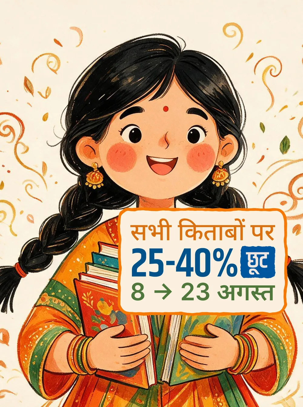
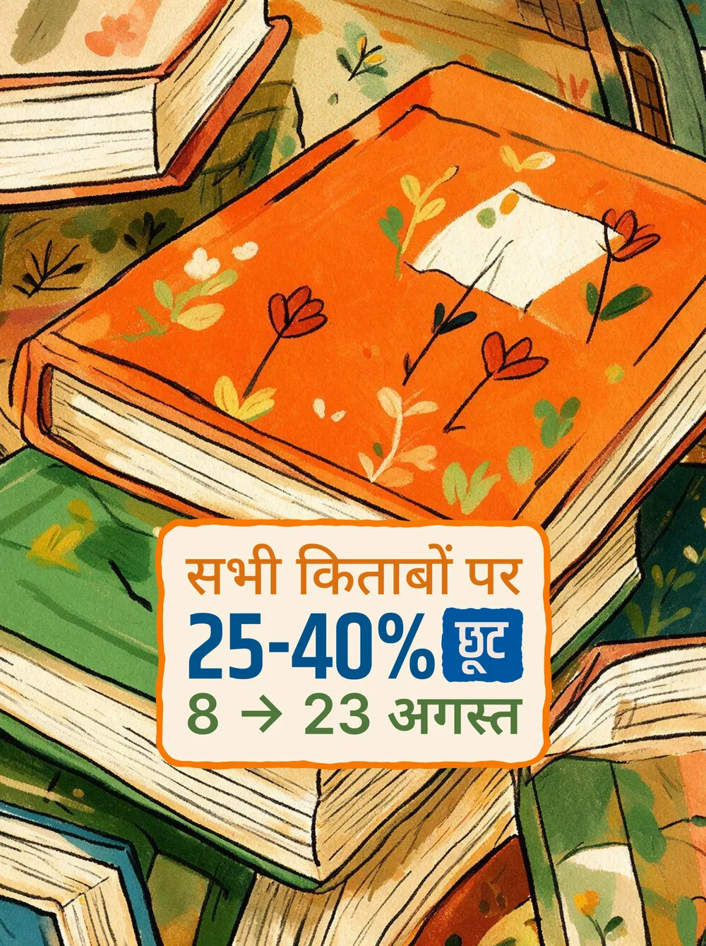
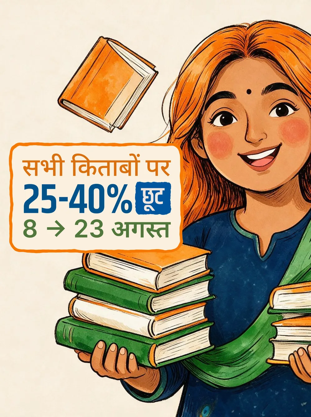
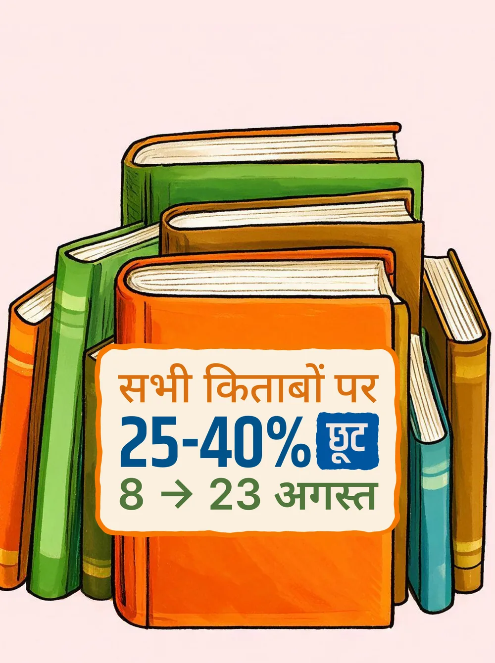
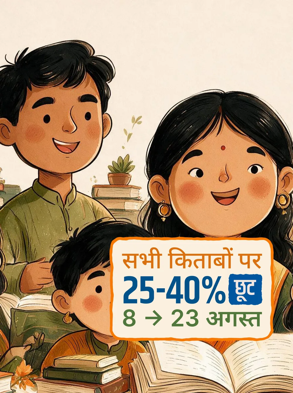
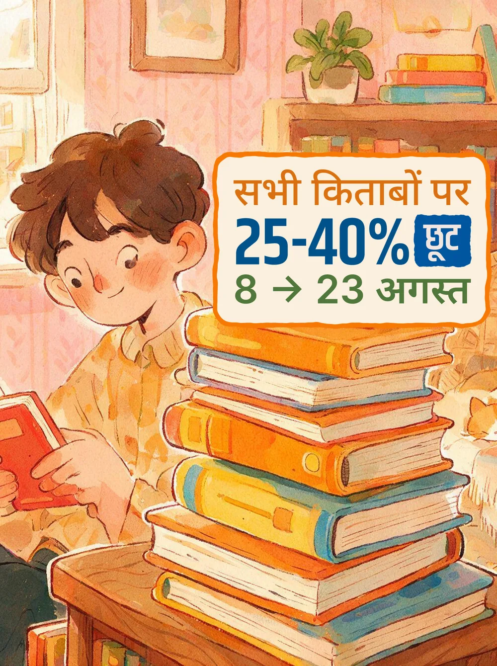
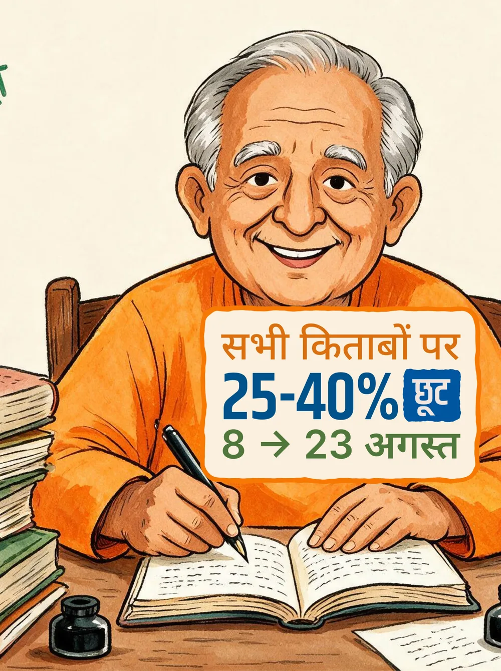
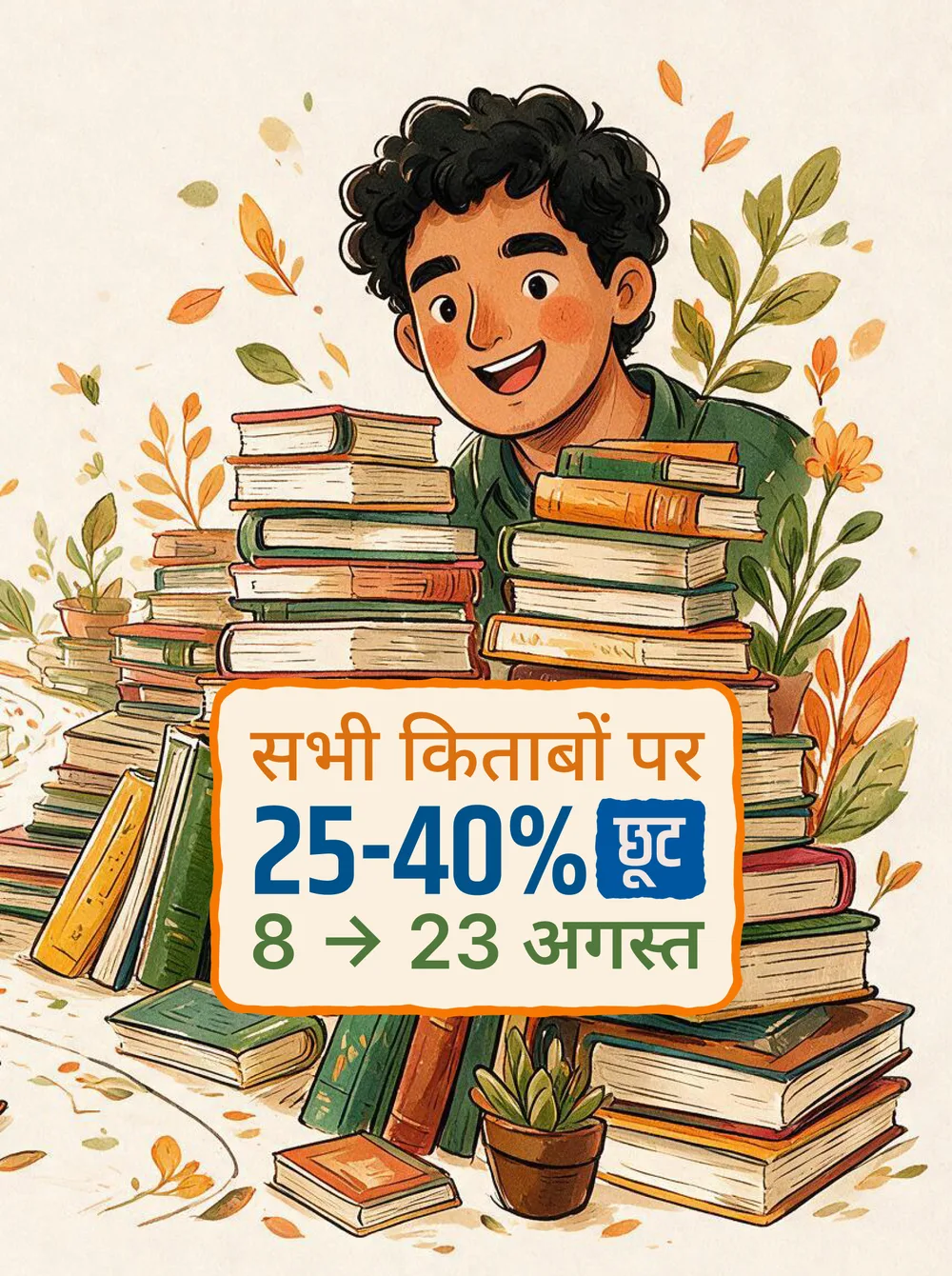
The same invitation, everywhere. आज़ादी के रंग, किताबों के संग (Colours of freedom, in the company of books), the line the Rajkamal team brought to us for the festival offer, ran the campaign, with a set of illustrated readers, young and old, carrying it across the site, the feeds and the stall walls. Same voice, same red, a different reader each time.
Each card belongs to a section: Freedom Sale, Rachanawali, Pratinidhi Kavitayan, gifting sets, children's books, the slow movers that needed a push. One system, twelve doors into the catalogue, so a reader always lands somewhere that is already for them.
Freedom Sale
8 to 23 AugustEvery August, everyone talks about freedom. For Rajkamal, that conversation comes from somewhere else. Reading itself is a kind of freedom: whoever reads forms their own opinion, not one borrowed from somebody else. So the sale was never really about the discount. The discount was only the door in.
That is what the 8 to 23 August window was built around. आज़ादी के रंग, किताबों के संग. A reader who might not buy a book all year gets one chance a year to choose something for themselves. The aspiration is not the price. It is the person you become after the book.
The design language shifted the same way. We started where every August campaign in India starts, with the three colours: saffron, white, green. But three shades alone don't make a sale feel like a celebration. They only announce the date; they don't build the mood.
So the palette opened up. The tricolour stayed as the spine, and around it came the festive layer: bunting across the top, sparklers, warm paper grounds, blue and green and orange sitting together the way they sit at a fair. Every card carries an illustrated reader, from grandmother to child, so the page shows the person before it shows the book. From flag to festival, that was the whole move.
परस्पर
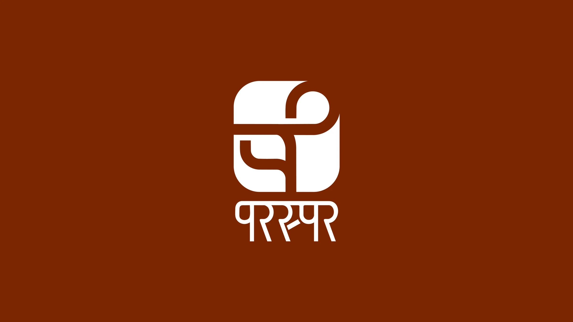
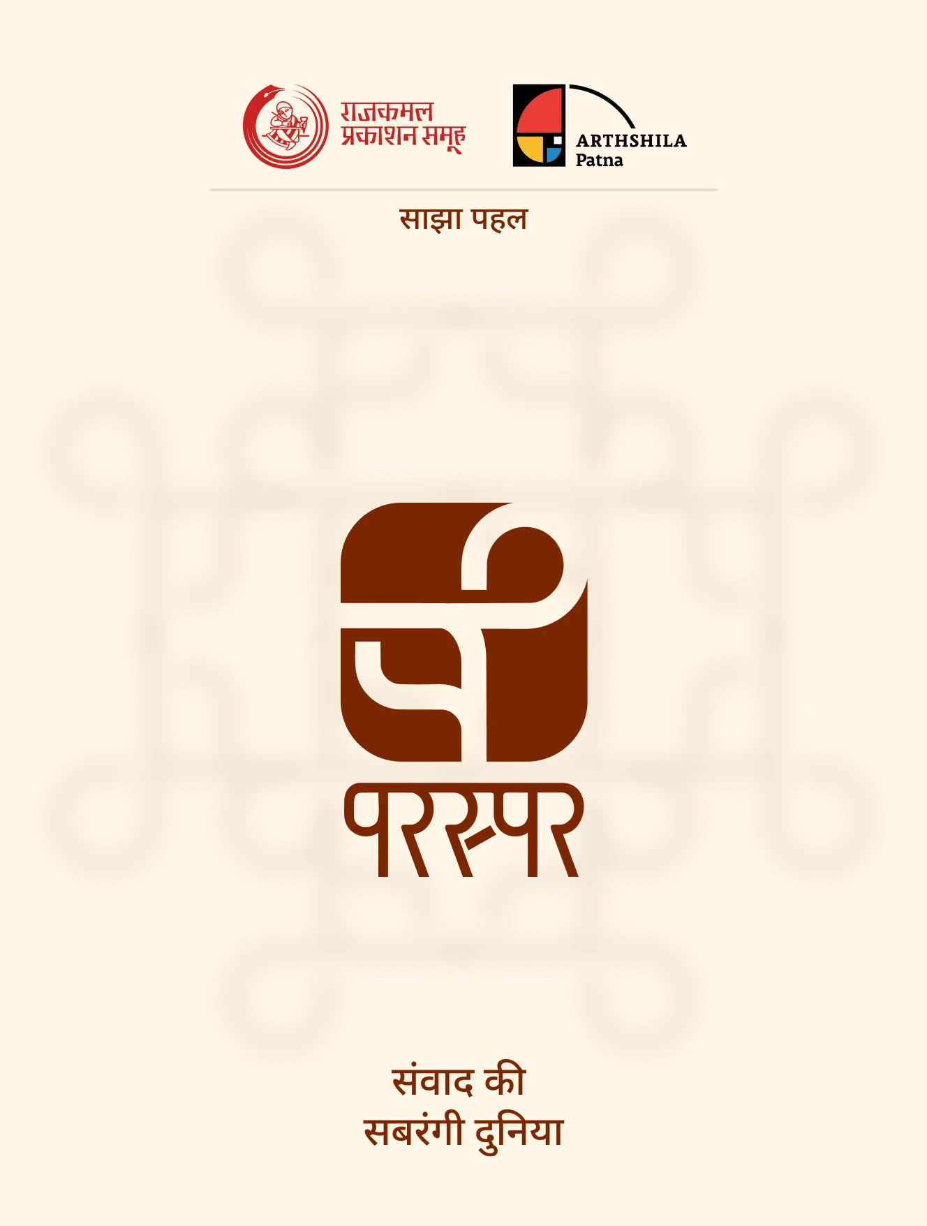
Identity for a joint initiative by Rajkamal Prakashan Samuh and Arthashila PatnaA joint initiative between Rajkamal Prakashan Samuh and Arthashila Patna. The name says it all: paraspar means with one another, towards one another.
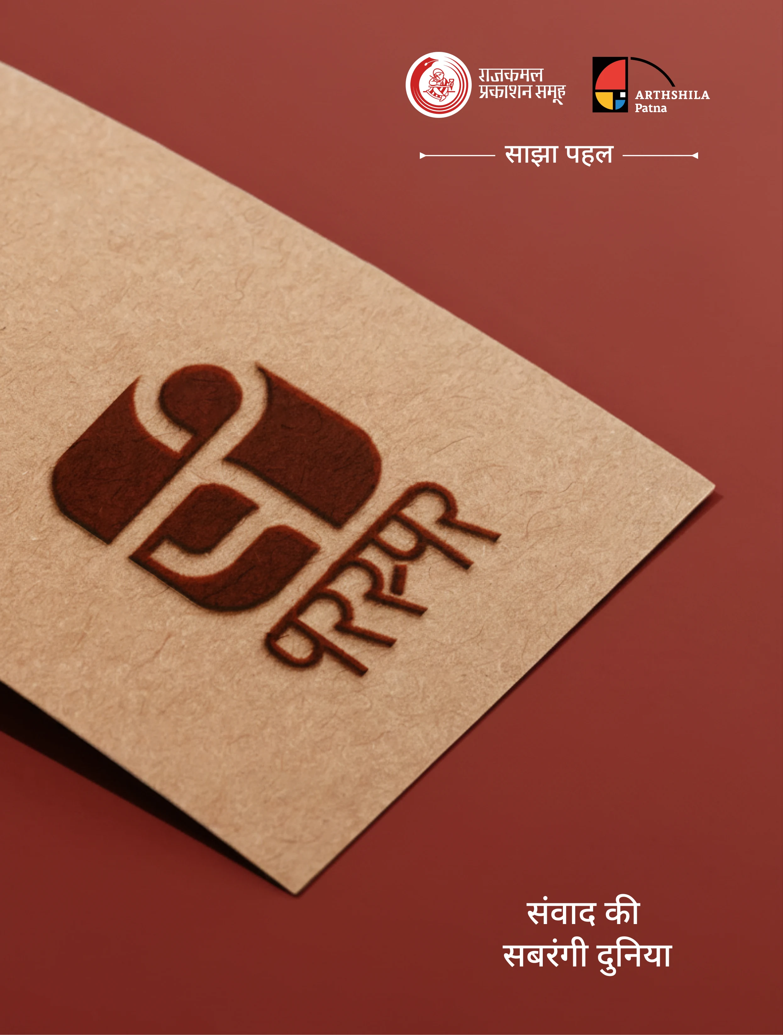
The mark is built inside a single rounded square. A page curling back on itself, and from that same fold, the letterform emerges. Not two separate things; one stroke that can be read two ways.
The wordmark is set in Devanagari, in the same weight and the same rounded corners, so the name and the mark feel like they came from the same hand. White on deep brown. संवाद की सबरंगी दुनिया. (A world of many-coloured conversation.)
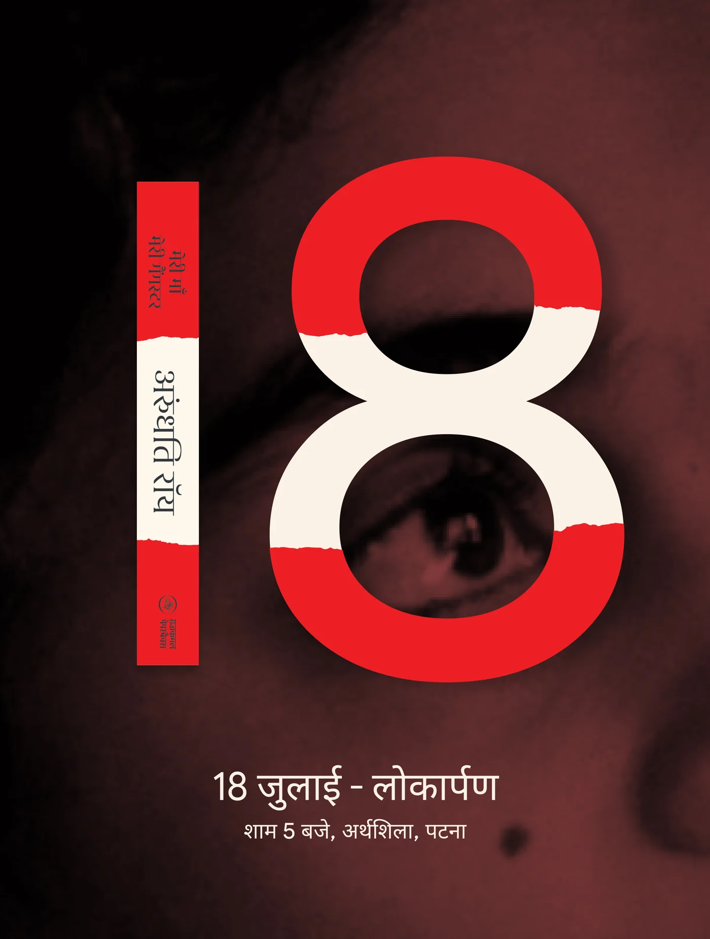
A launch poster has one job: make the date stick. So the date became the picture. The 18 was blown up so large that almost nothing else fits on the poster, and through the middle of it, the author's eye looks out. The same torn-paper strip that runs across the book's cover runs straight through the numeral, so the poster and the book read as one thing.
18 जुलाई, शाम 5 बजे, अर्थशिला, पटना (18 July, 5 PM, Arthashila, Patna). Every other detail stayed small beneath that one number, exactly as it should.
मेरी माँ मेरी गैंगस्टर
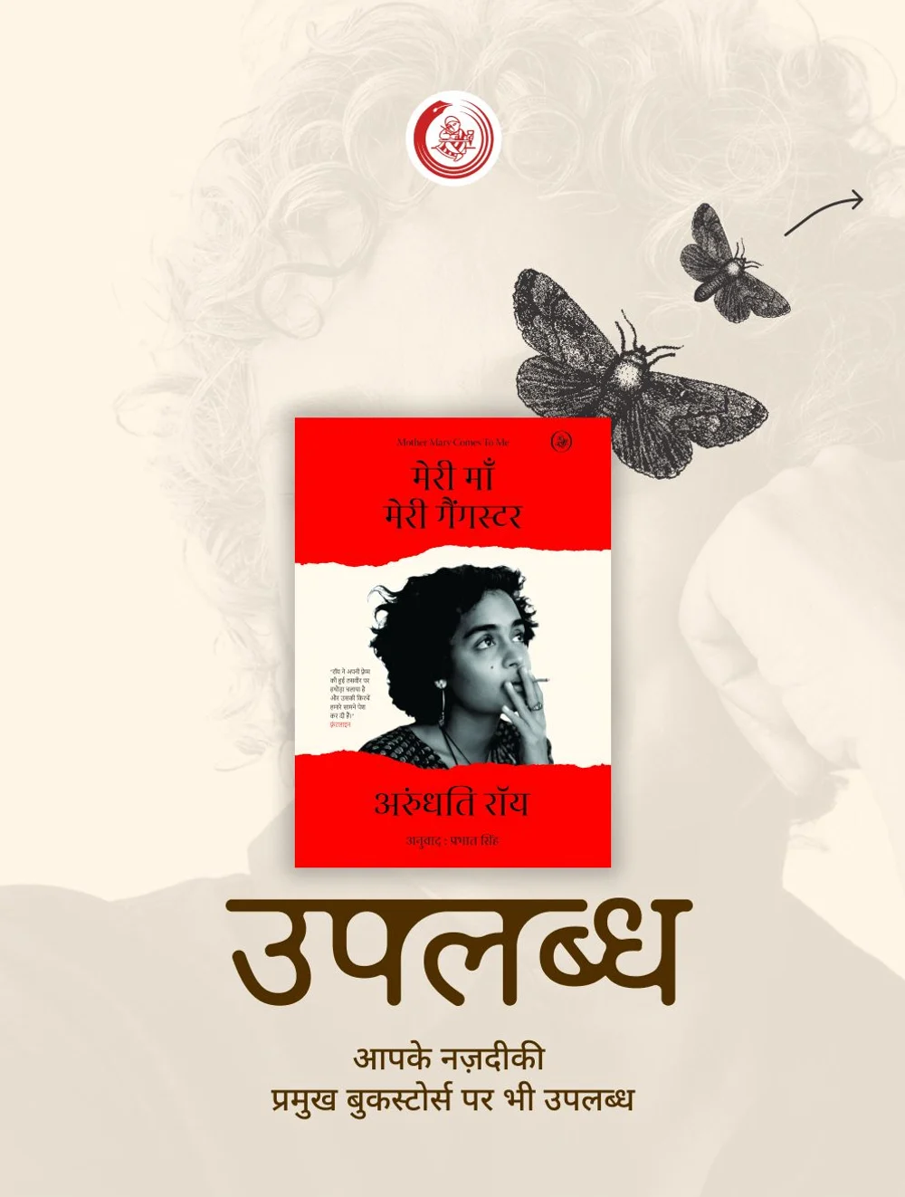
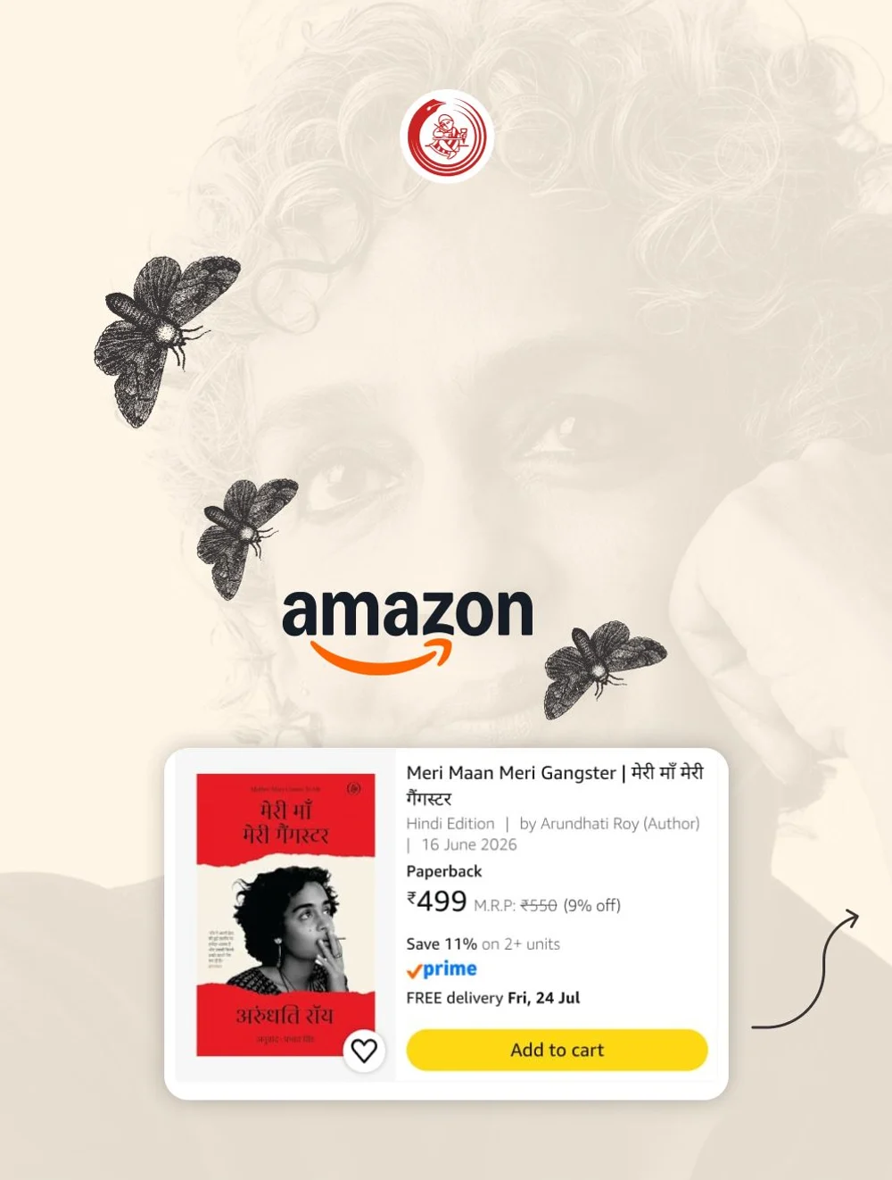
Launch carouselArundhati Roy's Mother Mary Comes to Me arrived in Hindi, translated by Prabhat Singh. The question was how to build a launch post that wouldn't feel tired across four slides.
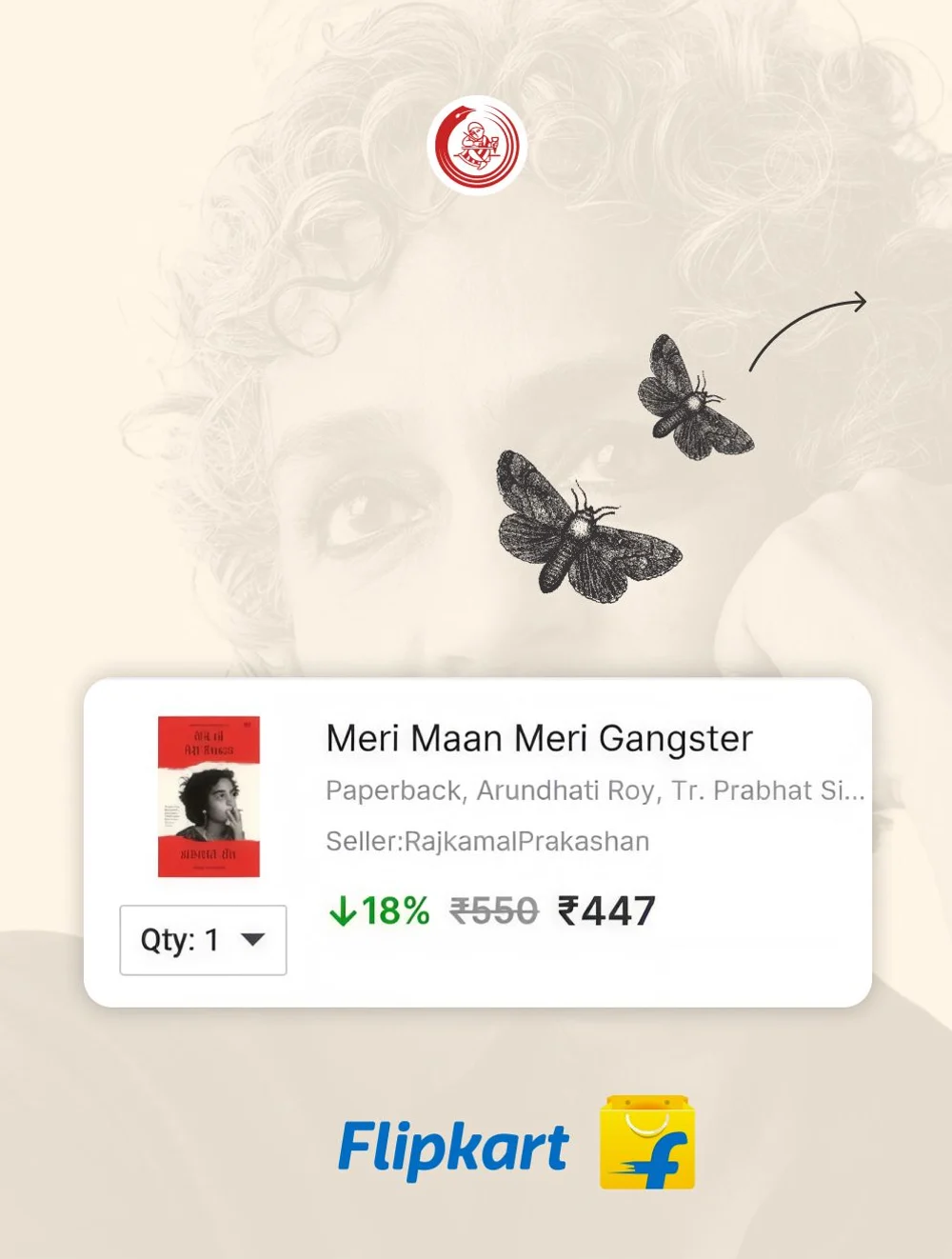
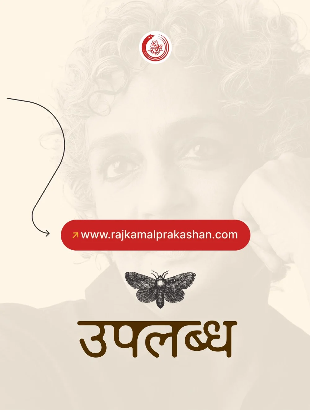
Breaking a poster into four pieces on its own doesn't achieve much. So one image was kept running behind all of them: the author's portrait, dissolved into cream, sitting behind every frame. Swipe through, and it feels like the camera is drifting across that one face, rather than four separate posters flipping past.
The reason to keep moving was also built into the frame itself. A moth flies out of one slide and lands in the next, and a thin arrow guides the finger to the edge. The moths came from the book's own world, so they read as part of the story, not as decoration.
The sequence was deliberate. The first frame only announces that the book has arrived, उपलब्ध (Available). The second and third take the reader to where the book already is, Amazon and Flipkart. And the last frame calls them home, to rajkamalprakashan.com. The marketplaces come first because that's where trust is built; the publisher's own site comes last because that's where the relationship is built.
Project credits
Client
Rajkamal Prakashan
Studio 1947
- Creative Direction & Strategy Rabi
- Internal Communication Santam
- Technology Building Soumic
- Design Zahid, Nikhil Raj Subba & Saumajit
- Data Analysis Sankhadipta
- Ads Management Santam
- 2D & 3D Art Nikhil Rai
Time and place
New Delhi, Sept, 2025
Viewed 0 times
More work

Fermy Lab
Nest Homes
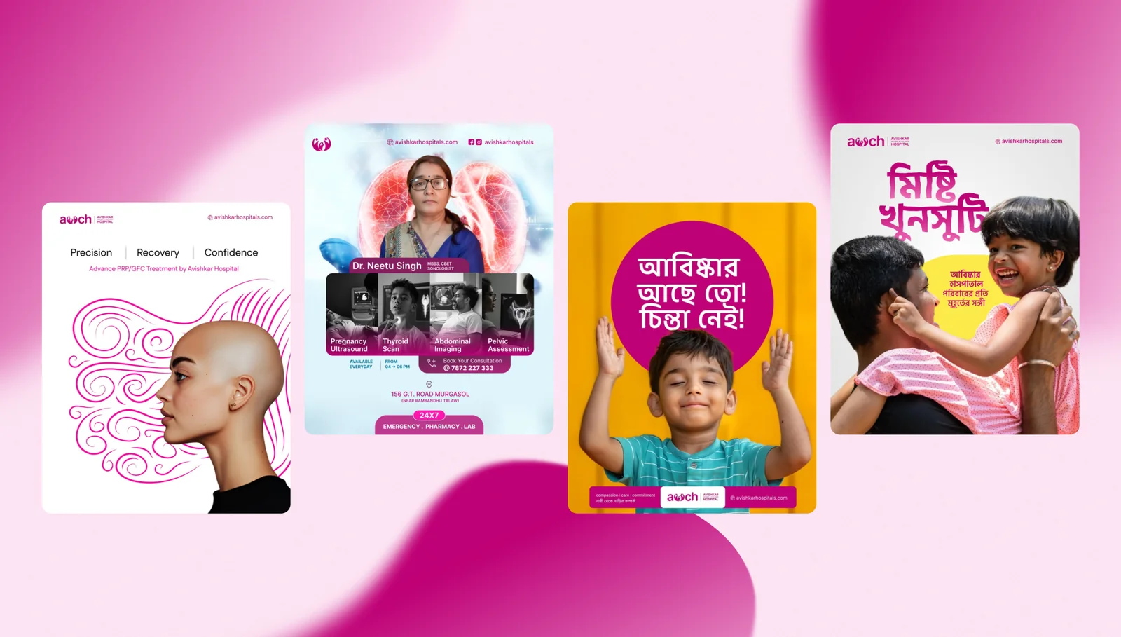
Avishkar Hospital
AIcrowd

Walking Project
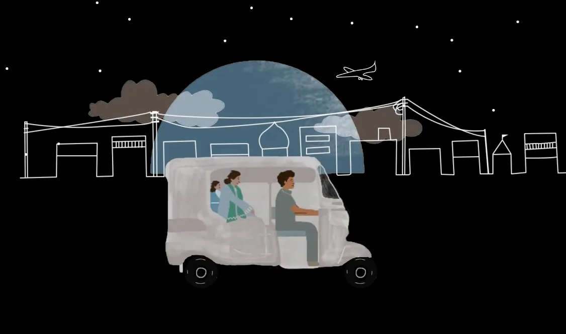
Local Futures
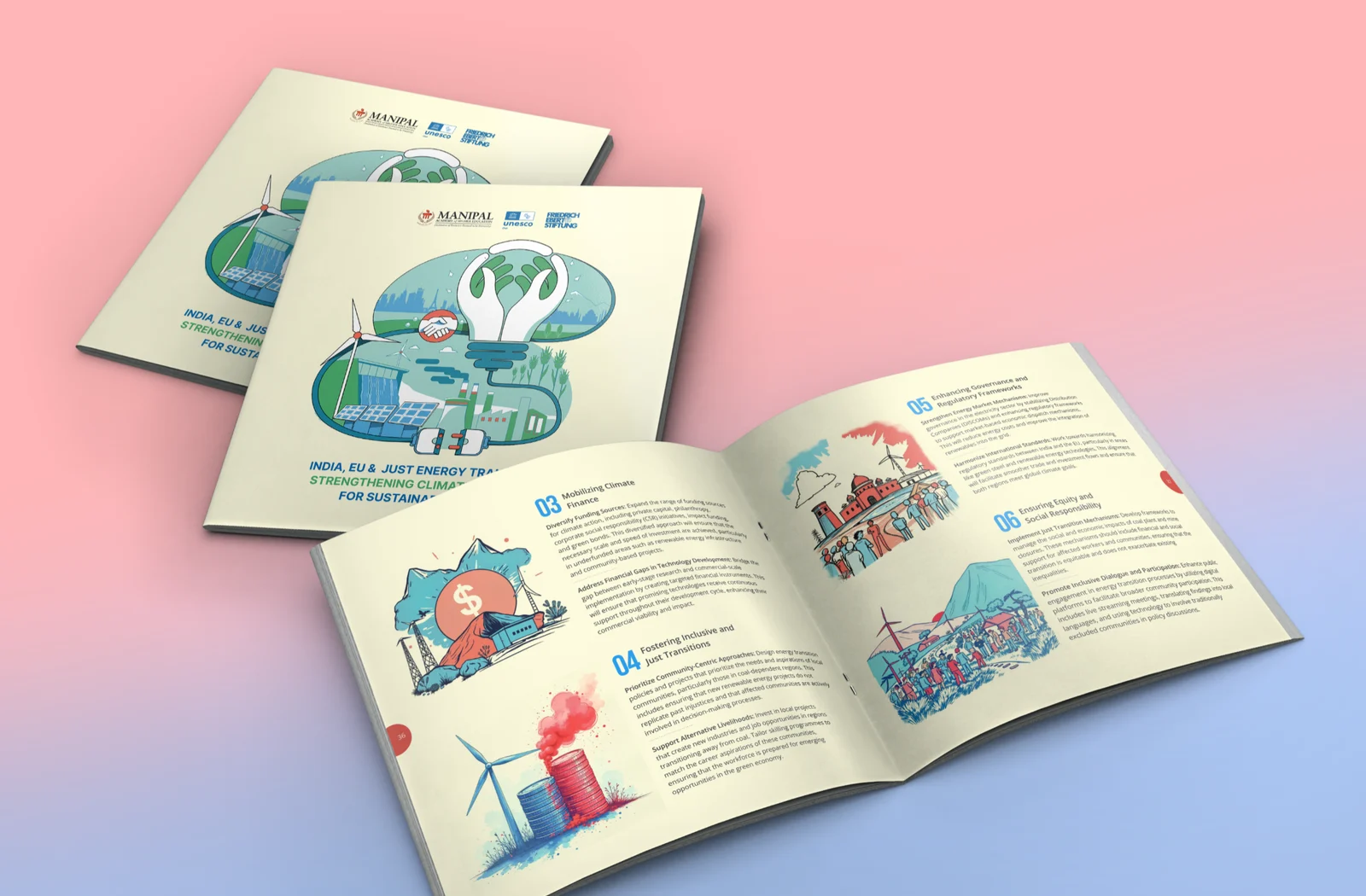
Friedrich Ebert Foundation
Frame Bengal
Jan Sahas
FIH Website Redesign

Remodel UN
Mirik College

Elegant Sip
Prokritir Group

Bhagyam Arts & Aesthetic

Village Ways
Radha Madhav Medical Hall

Healix
Kulam Homestay

Sikkim Himal Institute
Bhagirath Homestay