Avishkar Hospital
When hospital founders and executives look for a creative partner, they want design that does more than decorate a space. They want an agency that can build real trust, change how people behave, and make digital-first touchpoints that simplify patient care.
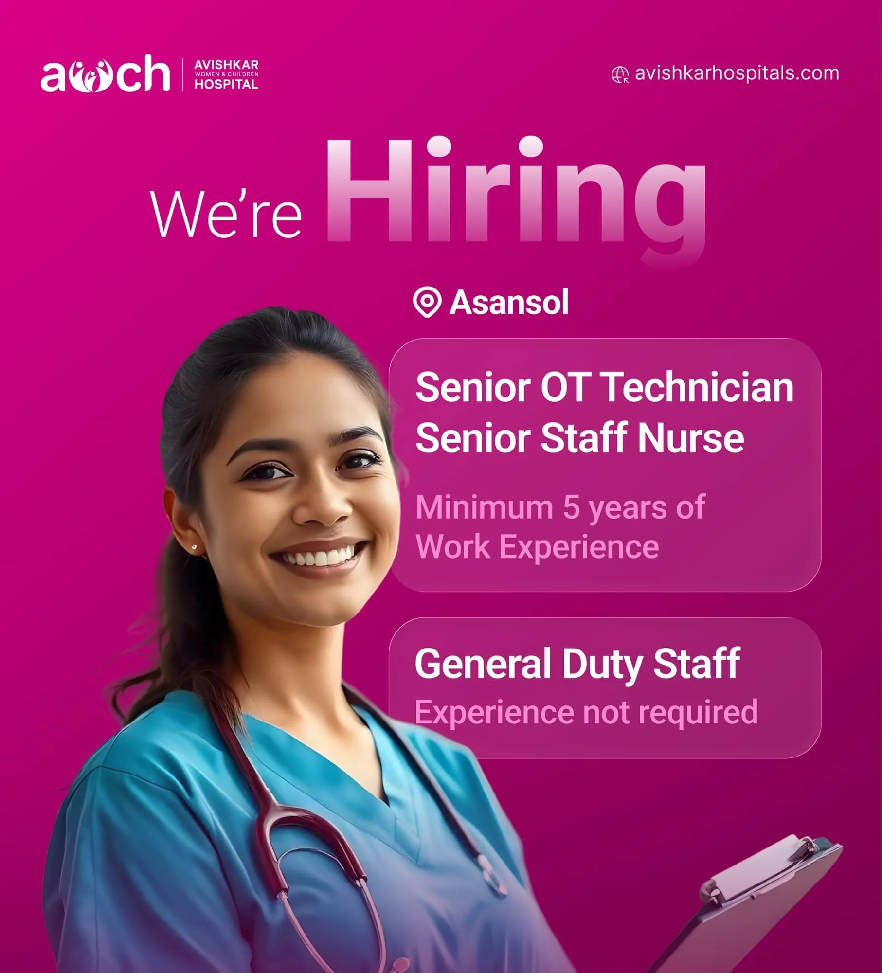
This case study shows how we helped AWCH (Avishkar Women & Children Hospital) become a modern, leading multispeciality hospital in Asansol. By shifting how the region saw it and removing digital friction, we built a complete communication system focused on authority, access and community impact.
Strategic Context & The Regional Trust Gap
Avishkar Women & Children Hospital (AWCH) was planned as a state-of-the-art multispeciality hospital bringing top medical infrastructure directly to families in Asansol. It is dedicated to specialised, compassionate care, with no operational shortcuts in the patient experience.
Healthcare brands in Tier-2 cities face a particular hurdle: little digital trust and scattered communication. For years, many families in Asansol took on the emotional and financial strain of travelling all the way to Kolkata for critical treatment. Not because local hospitals were lacking, but because local brands lacked visual confidence and awareness.
Our main job was to close this confidence gap. The identity needed to balance:
Emotional Warmth
Reassuring anxious patients and protective parents.
Clinical Authority
Showing absolute medical professionalism.
Cultural Familiarity
Making the visual environment feel approachable and local, not intimidating and corporate.
Parent-Brand Architecture
To protect the hospital from future design debt, we built an adaptable visual structure. AWCH is the master identity. Specific wings (such as Paediatrics, Gynaecology, Emergency Care, and advanced Dermatology and Skincare Treatments) sit under it. As the hospital adds services, every new department and clinic instantly inherits the brand's existing equity, which saves promotional costs over time.

Visual Direction & Design Tokens
Breaking the "Sterile Blue" Cliché
Standard healthcare branding is crowded with cold, saturated blues that feel clinical and distant. To set AWCH apart across the region, we built a distinct, high-contrast palette:
Typography: Accessible and Stress-Free Readability
In stressful medical settings, the typeface must be an invisible tool for fast reading.

Putting the System to Work
To show how the system reaches patients at every stage of their care, we applied the visual assets across key physical and digital channels:
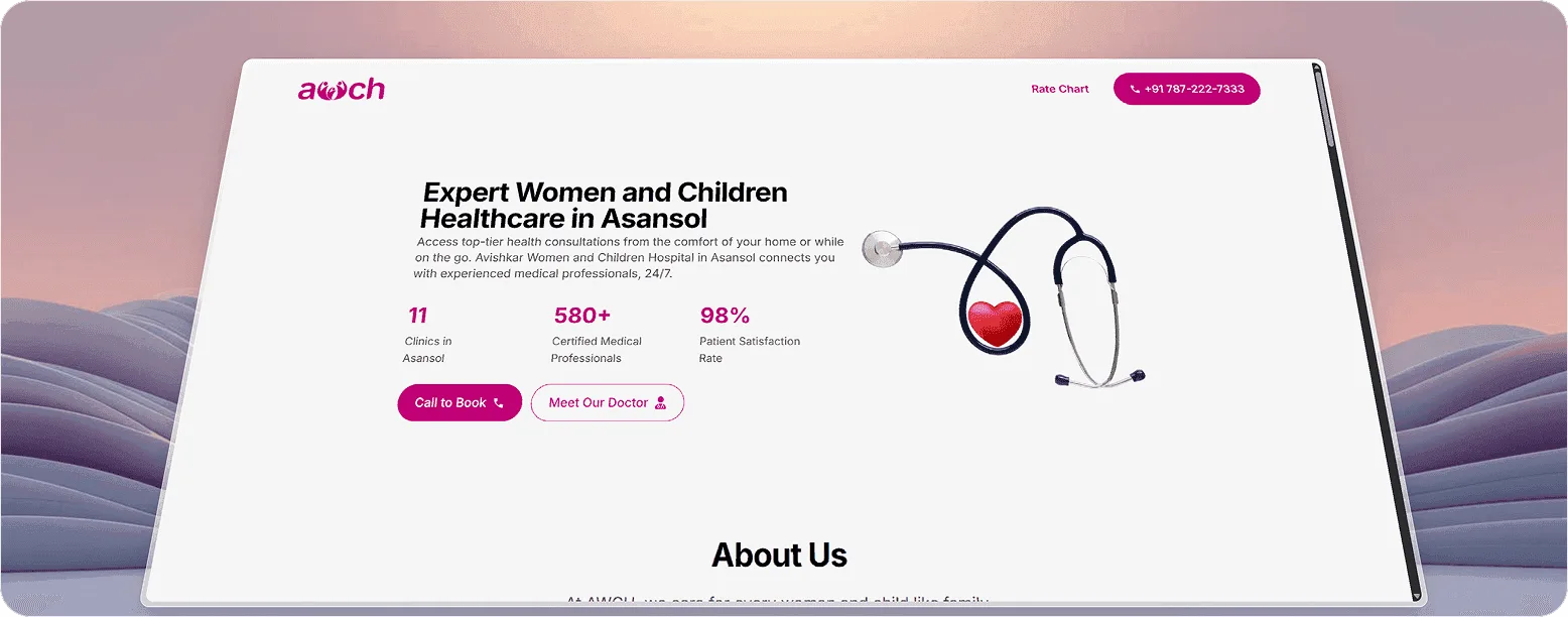
We designed the desktop and mobile websites as trust-building tools, not static walls of information.
Simplified Information Architecture
Healthcare information is laid out in easy-to-scan layouts, so anxious users can find doctors, key departments and emergency contact details within seconds.
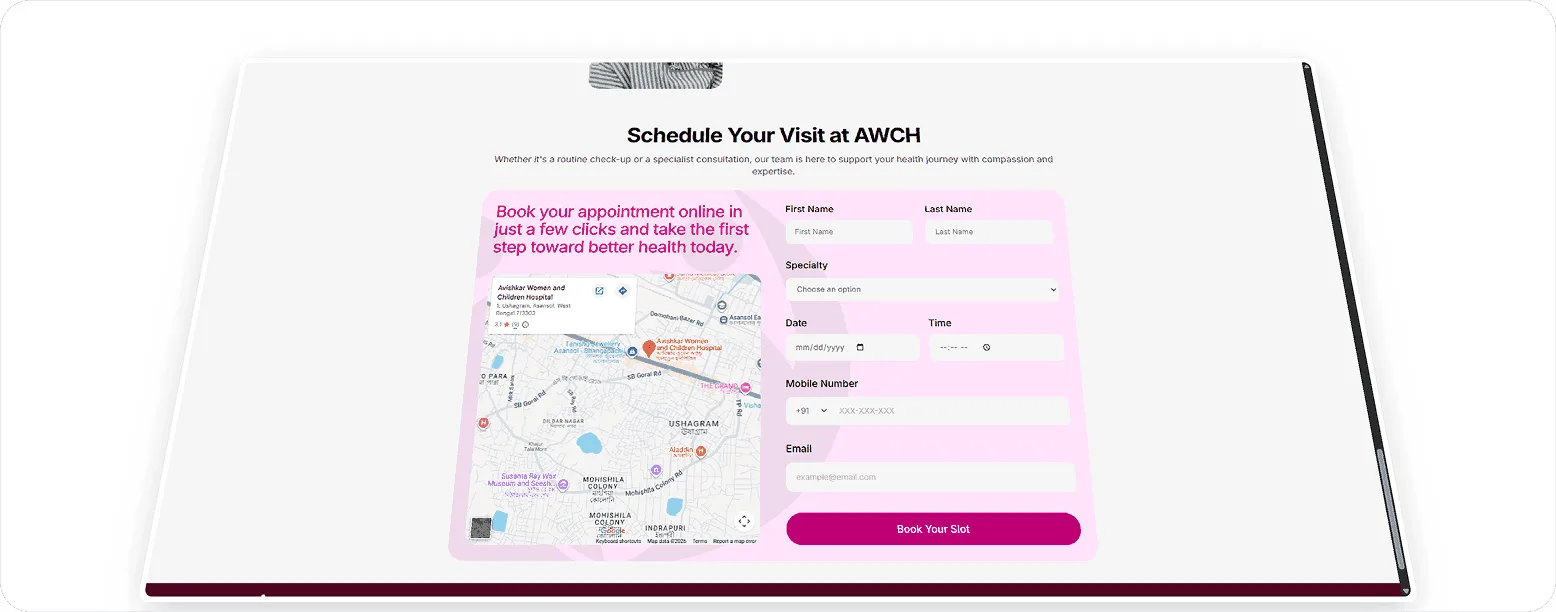
Frictionless Appointment UX
We designed a clean, intuitive booking flow with no unnecessary steps. It builds credibility straight away and helps shorten the queues at the hospital's reception desks.
Accessibility-First UI
Clean typography and generous breathing space keep the layout easy on the mind. The site feels effortless for users of all ages and levels of digital confidence.
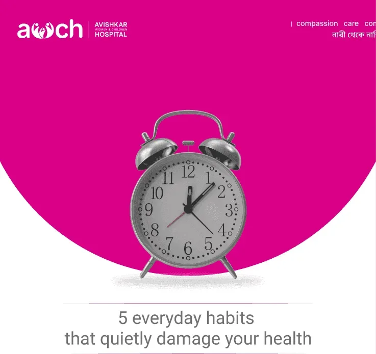
Social platforms are the main way to build local awareness in Asansol.
Template Scaling
We built modular graphic templates that keep a strict visual style, recognisable brand colours and a bold typographic hierarchy across all health-education posts.
Instant Recall
This structure means every post stands out in a crowded social feed as an authoritative, caring message from AWCH.

Project credits
Client
Avishkar Hospital
Studio 1947
- Creative Direction Rabi , Som
- Design Zahid, Nikhil Subba
- Content Nadia, Sweety
- Website Design & Development Soumajit, Santam
- Video Ahmed, Nikhil Subba
Time and place
Asansol, April, 2025
Viewed 0 times
More work
Rajkamal Prakashan

Fermy Lab
Nest Homes
AIcrowd

Walking Project
Local Futures
Friedrich Ebert Foundation
Frame Bengal
Jan Sahas

FIH Website Redesign

Remodel UN
Mirik College

Elegant Sip
Prokritir Group

Bhagyam Arts & Aesthetic

Village Ways
Radha Madhav Medical Hall

Healix
Kulam Homestay

Sikkim Himal Institute
Bhagirath Homestay