ReModelUN
Context & The Challenge
The MissionReModelUN is a high-profile podcast featuring thought leaders from UN-affiliated groups around the world. They discuss ethical, AI-driven solutions for social good.
The brand needed an identity that felt serious enough for international diplomats, yet quick enough to keep up with AI. It also needed a "sustainable framework": a system that could spin off future conferences and scholarships without weakening the core brand.
Brand Strategy & Logo System
The "re" Loop: Continuous IterationAI is not a fixed destination. It is a process that keeps going. The 're' loop stands for constant remodeling, adaptation and forward movement. Set inside a deliberate, closed cycle, the visual language mirrors the podcast's core theme: keep checking, rethinking and improving global systems through technology.
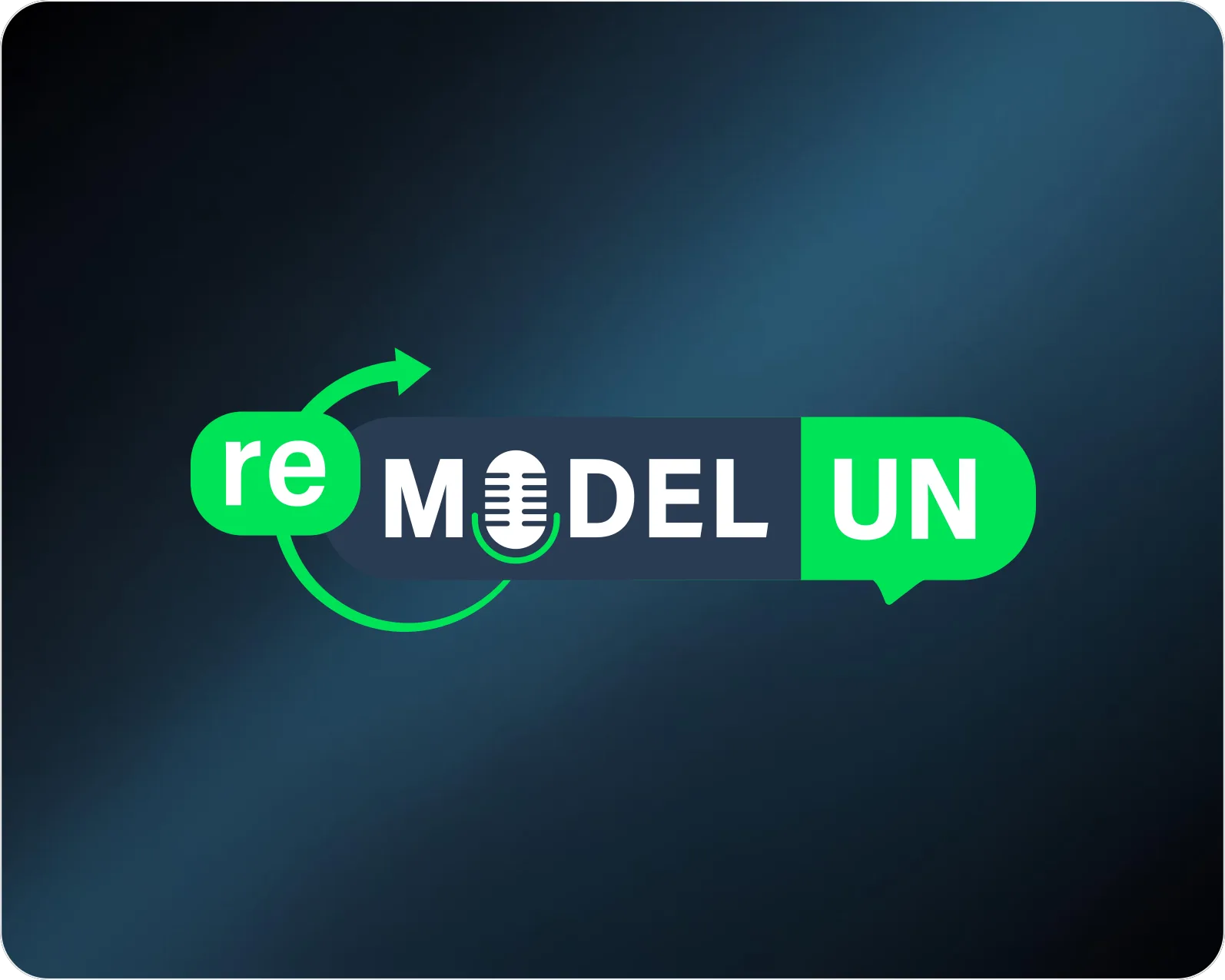
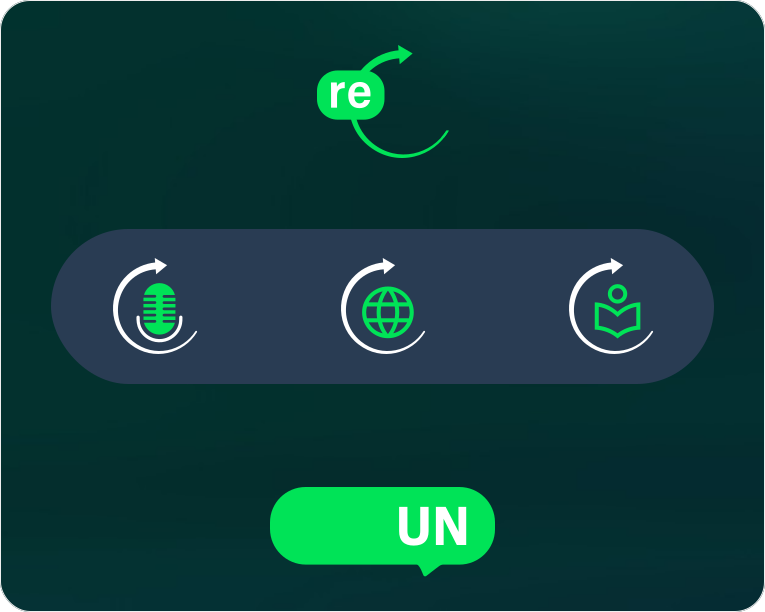
The center of the logo works as a bridge. For the main brand, the microphone icon places the mark firmly in audio and broadcasting. But this slot is built to change. Because the icon can be swapped, the same wordmark adapts for sister ventures (a podium for conferences, a cap for scholarships) without losing its shape.
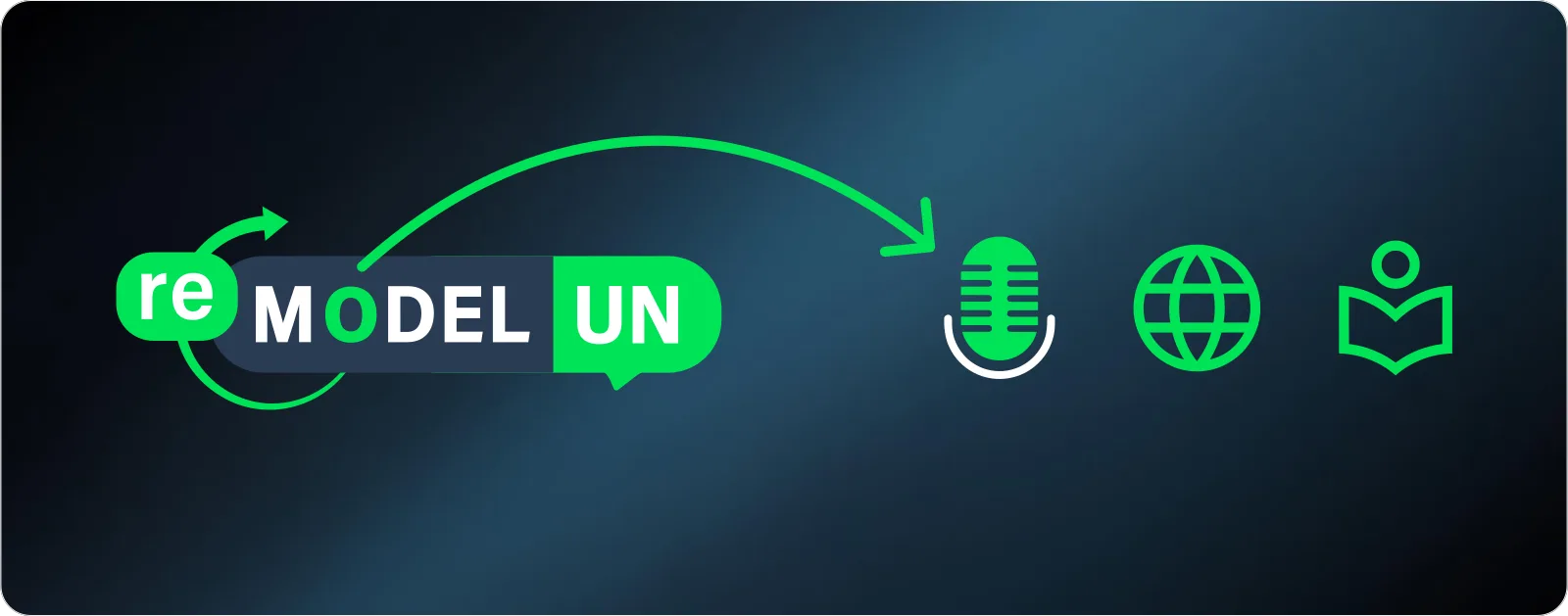
Global change doesn't happen in a vacuum. It happens through conversation. So the 'UN' at the end is shaped as a speech bubble, to stress dialogue, cross-border collaboration and human-first storytelling. It takes the authority of UN-affiliated organizations and makes it warm, approachable and open to talk.
Color Theory
The ReModelUN identity sits at a crossroads. It has to respect the weight and prestige of international diplomacy, and also catch the fast-changing energy of artificial intelligence. The palette is a deliberate, high-contrast pairing chosen to bridge those two worlds.
Institutional Authority & Grounded Trust
Primary ColorDark Cyan is the foundation of the whole brand. It is a deliberate step away from the bright corporate blues usually linked with global bureaucracies. This deep, muted tone brings a calm, academic weight instead. It signals wisdom, research-backed integrity and the composure needed for big global challenges. Using it as the main backdrop gives us instant credibility with UN-affiliated thought leaders and global organizations.
AI Innovation & Bias toward Action
Secondary ColorIf Dark Cyan stands for the institutional problem, Fresh Lime is the technological answer: a bright accent colour that cuts against the deep primary base and pulls the eye to interactive UI parts, useful resources and key insights.
When these two colors meet, they create a clear, easy-to-scan hierarchy that suits premium dark-mode interfaces.
Primary: Dark Cyan
Gives the layout stability and high-contrast readability for body text and structure.
Secondary: Fresh Lime
The high-visibility callout for active states, key numbers and dynamic brand elements.
We keep a strict ratio: Dark Cyan covers 80% of the brand space and Fresh Lime hits hard at 20%. That way the brand carries authority while staying clearly tech-forward.
The Typography System
Legible in print and on screen, so the brand looks the same in every medium.
When a brand deals with dense, academic global challenges alongside fast-moving AI discussion, the typeface cannot be decorative or distracting. It has to be an invisible, hard-working carrier for ideas.
We built the whole brand on Roboto. We chose it for its neo-grotesque, geometric discipline. Its friendly, open curves make technical content feel approachable and easy to read.
Beyond looks, choosing a typeface is a business decision. Roboto is a variable type system, freely available in the open-source Google Font Library. Picking it removed a big practical hurdle for ReModelUN.
Future internal teams, international chapter organizers and outside web developers can grow the brand anywhere in the world without licensing friction, missing-font errors or recurring seat costs. It shows prospective clients that we design with their long-term budget and daily workflow in mind.
Multi-Platform UI/UX Experience
Extending the System Across Digital RealitiesA strong brand identity has to move across many digital platforms without losing its core message. For ReModelUN, the UI/UX work turns static brand guidelines into working, practical touchpoints: video production, dedicated audio players and small-screen environments.
The Video Broadcast Tier
The Component
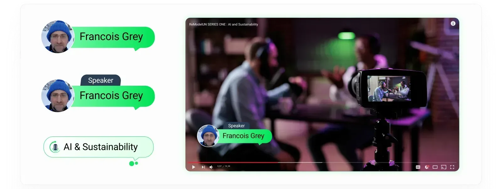
Simple, high-contrast video overlay templates for multi-host and guest setups.
The UX Challenge
Video backgrounds are unpredictable. Overlays have to stay readable no matter the speaker's lighting, framing or background.
The Solution
We made a pill-shaped, two-tone frame in the brand colors. The speaker's photo sits in a circle, with a Fresh Lime container for their name. Dark flags label their role and topic, like 'AI & Sustainability.'
The Human-First Podcast Thumbnail System
The Component
A modular cover art and thumbnail template system built for the big audio streaming platforms (Spotify, Apple Podcasts, Google Podcasts).
The UX Challenge
In audio streaming, cover art has to stop a scroll in under a second. We needed a template that keeps the brand consistent while making each episode and guest stand out.
The Solution
The system uses a square thumbnail laid out like a premium card. It leads with high-resolution guest photography rather than abstract graphics, blending the portrait into the background to leave a clean surface for text.
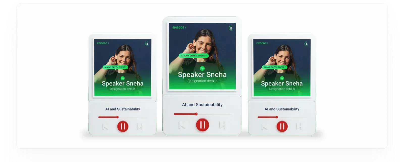
By handing over one standard layout template instead of loose one-off graphics, we gave the ReModelUN marketing team a plug-and-play production kit. They can keep the podcast growing, swapping guest photos and text in moments while the look stays uniform and premium on every streaming network.
Design Philosophy
A visual identity is only as strong as its real-world use. When brand assets are spread across marketing teams, developers and international event organizers, they risk being watered down. To make sure ReModelUN looks the same and speaks with authority at every touchpoint, we set clear rules for how assets are used. This section shows that care: the main marks stay clean, standard and intact wherever they appear, on screen or in print.
To keep the mastermark prominent, it must always be protected from nearby text, margins and other graphics. We set the minimum clearspace at exactly "1 mic distance", measured from the height of the microphone inside the logo.
Because the breathing room is tied to a part of the logo itself, the safe zone scales with it. The brand stays intact whether the logo sits on a huge event banner or a small phone screen.
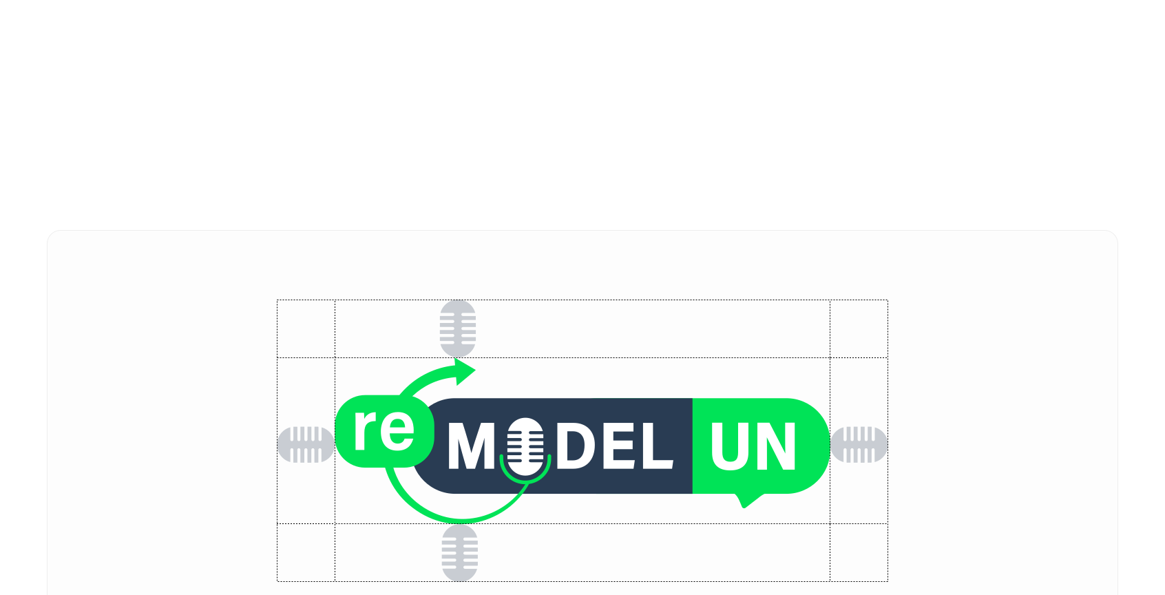
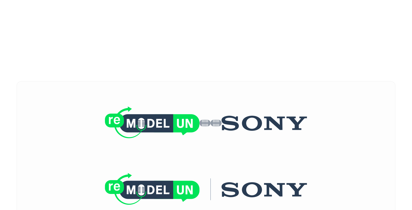
Big global initiatives naturally call for co-branded layouts. When the mastermark sits next to close partners or media affiliates such as Sony, the spacing rules get stricter.
We double the usual padding to a 2-mic buffer for partner lockups. This keeps the logo from being crowded, so ReModelUN shares the stage fairly with global partners while keeping its own presence.
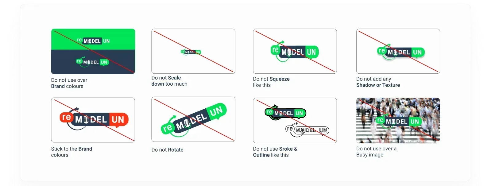
To remove guesswork for production and engineering teams, we wrote a clear matrix of what not to do. These rules prevent common layout mistakes and protect the identity from random changes.
By spelling out these rules, we show prospective clients that we don't just hand over loose artwork. We hand over a disciplined, ready-to-use brand asset kit built to stand up to real-world production.
Project credits
Client
ReModelUN
Studio 1947
Time and place
Geneva, June, 2025
Viewed 0 times
More work
Rajkamal Prakashan
Fermy Lab

Nest Homes
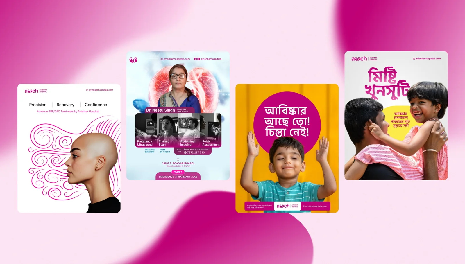
Avishkar Hospital
AIcrowd

Walking Project

Local Futures
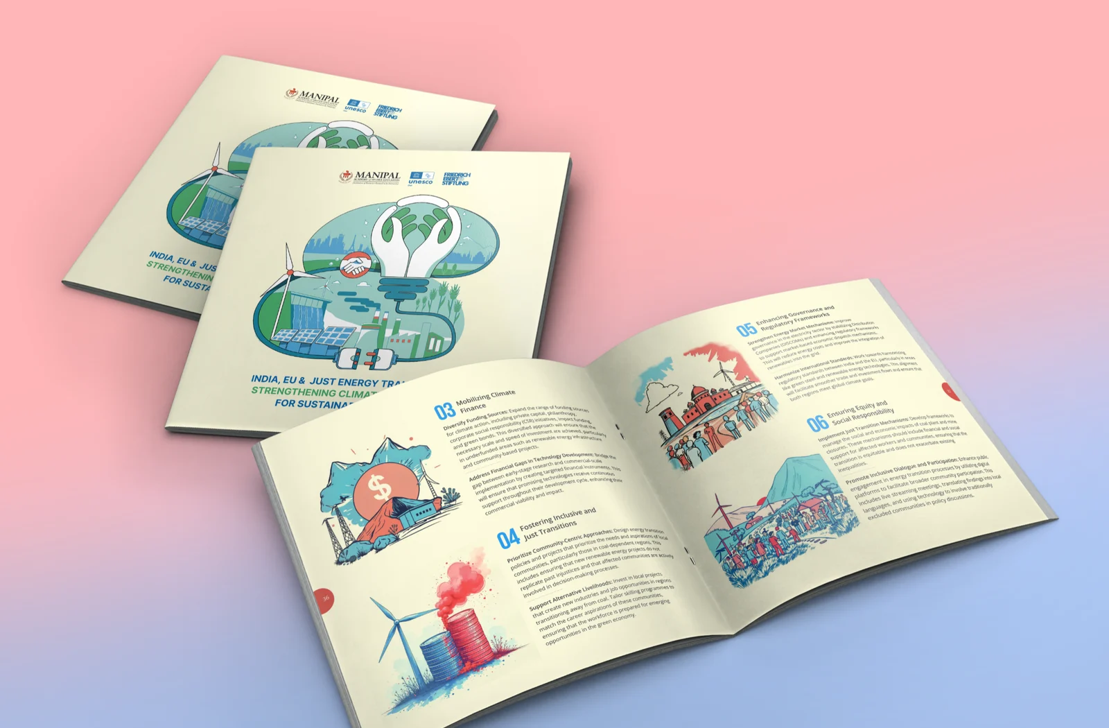
Friedrich Ebert Foundation
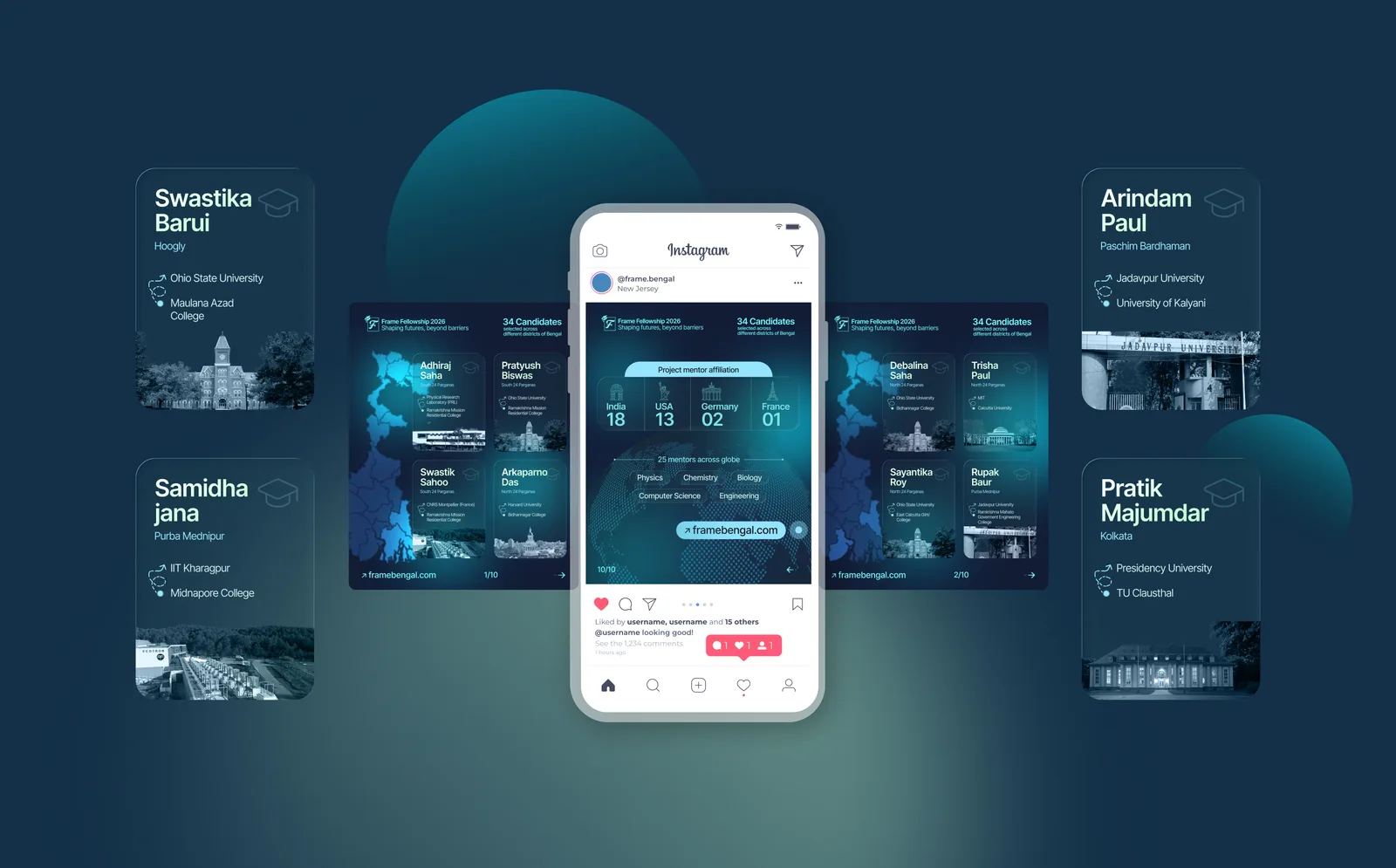
Frame Bengal
Jan Sahas
FIH Website Redesign

Mirik College

Elegant Sip
Prokritir Group
Bhagyam Arts & Aesthetic

Village Ways
Radha Madhav Medical Hall
Healix

Kulam Homestay

Sikkim Himal Institute

Bhagirath Homestay