About Us Portfolio Solutions Products Initiatives Blogs Say Hello

Language

English Hindi Coming Soon Bengali Coming Soon Nepali Coming Soon
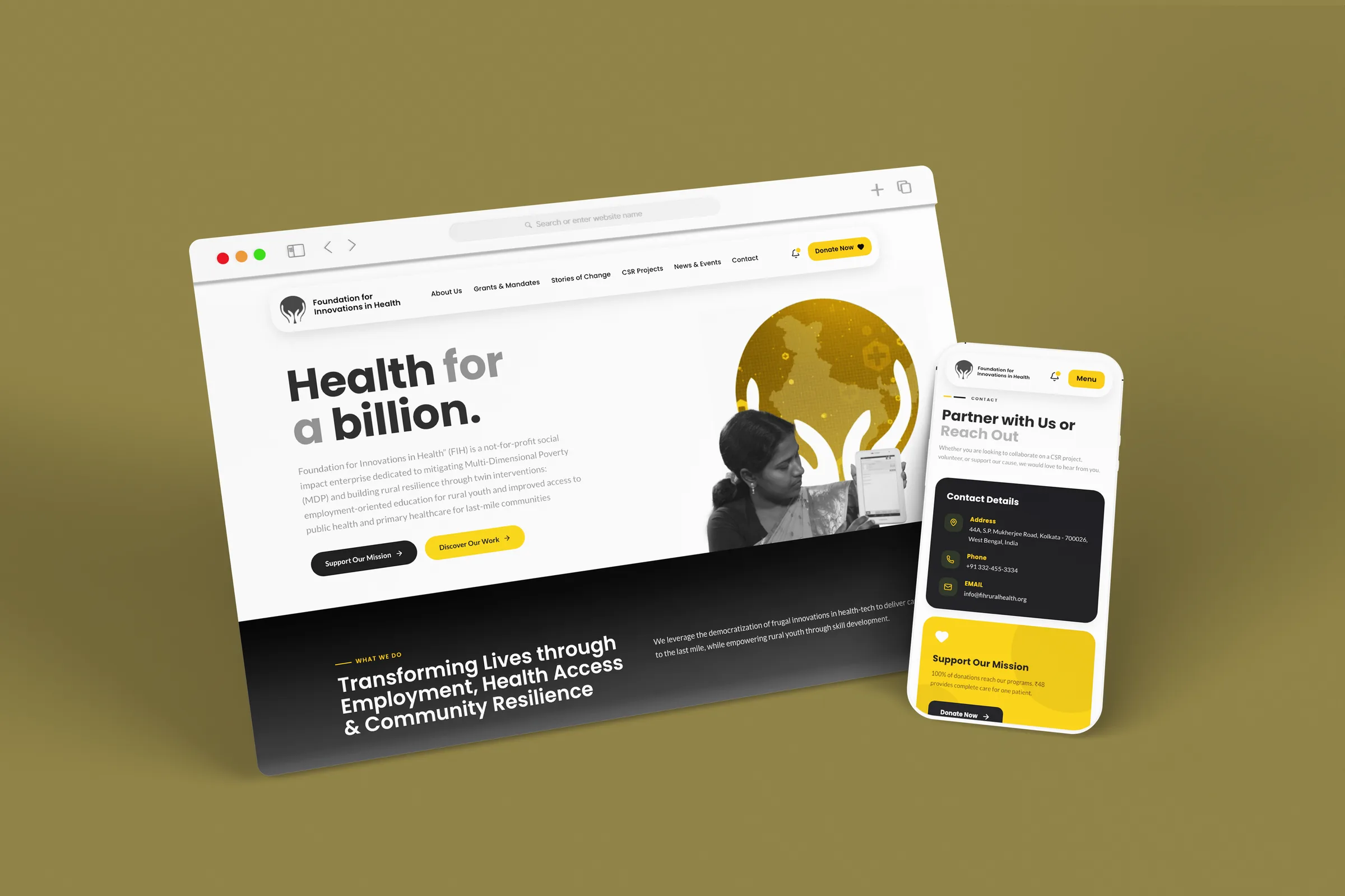
The Foundation for Innovations in Health website on desktop and mobile: the Health for a billion homepage beside the contact screen, on an olive ground

FIH Website Redesign

WebsiteRedesignUI/UXCMS Kolkata & Rural India 2026

The Foundation for Innovations in Health runs digital clinics in Birbhum, a medical boat in the Sundarbans, and training programmes that put rural young people into hospital jobs. It is complicated work, done in places most donors will never visit.

All of that had to fit on a website, and the old one left visitors to piece it together themselves. Our brief was simple to say and hard to do. A CSR head with ninety seconds should be able to understand what FIH does, believe it is real, and know how to fund it.

fihruralhealth.org

The rebuilt site

One sentence carries the whole organisation, and everything below it is proof. Health for a billion sits alone at the top of the page, followed straight away by the two things FIH actually does.
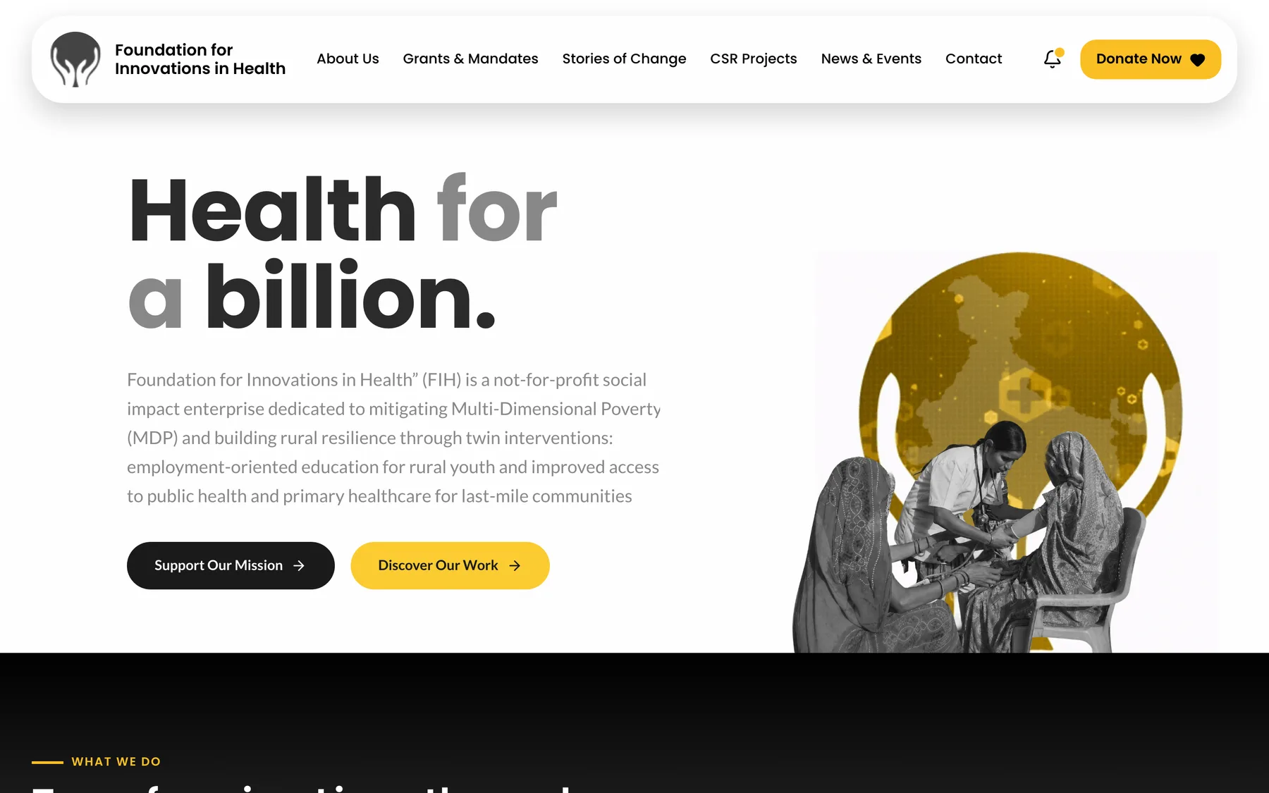
FIH homepage hero: the headline Health for a billion beside an illustration of hands holding a map of India
The homepage opens with the mission and two buttons, not a slideshow
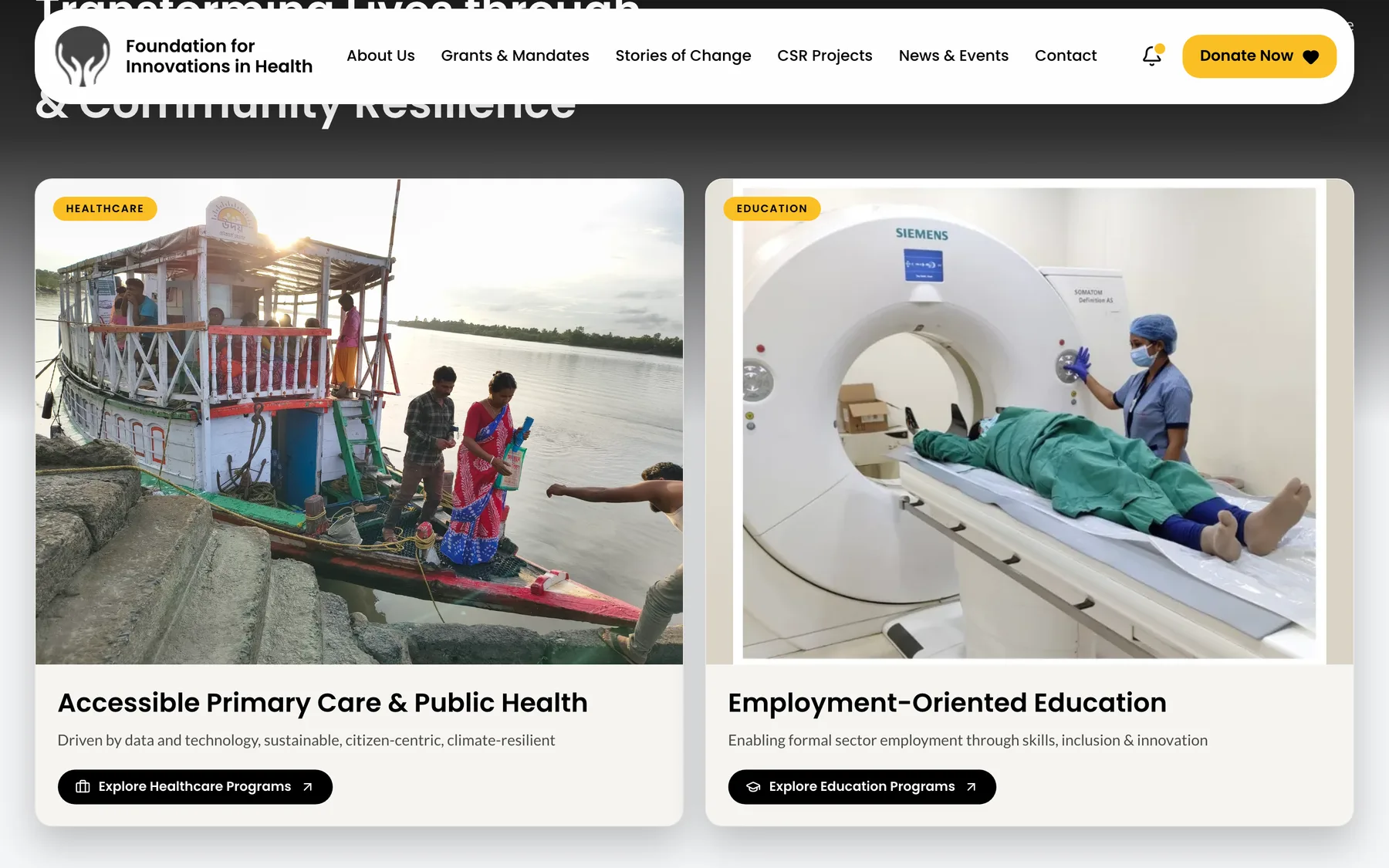
Two programme cards on the FIH homepage: Accessible Primary Care and Employment-Oriented Education
The whole organisation as two doors: healthcare and education. Everything else lives behind one of them

Cutting it down

Simplification

The hardest part of this project was not building anything. It was deciding what to leave out.

FIH does a great deal, and every part of it matters to someone inside the organisation. But a visitor is not reading a report. They are scanning, deciding whether to trust you, and leaving. So we made a rule for the whole site. One idea per screen, and no screen that exists only to introduce another screen.

Two paths, not twelve

Healthcare and education. Every programme, project and story hangs off one of those two, so nobody has to hold a menu in their head.

Numbers where the claim is

Clinic counts, cost per visit and placement figures sit next to the sentence they support, not in a statistics page nobody opens.

Plain words

Task-shifting became what it actually means: a trained health worker does the visit, a doctor joins by video. The jargon stayed for the people who need it, further down.

The work, shown as work

Visual ethnography

Non-profit websites tend to fill up with stock photography. It costs them the one thing they cannot buy back: being believed. Nothing on this site is bought.

Every image is from the field. The boat clinic pulling into a bank in the Sundarbans, a health worker with a tablet, a classroom of trainees, a scan room. We treated the photography as evidence, not decoration. So we kept the frames wide, left the ordinary details in, and wrote captions that say where you are and what is happening.

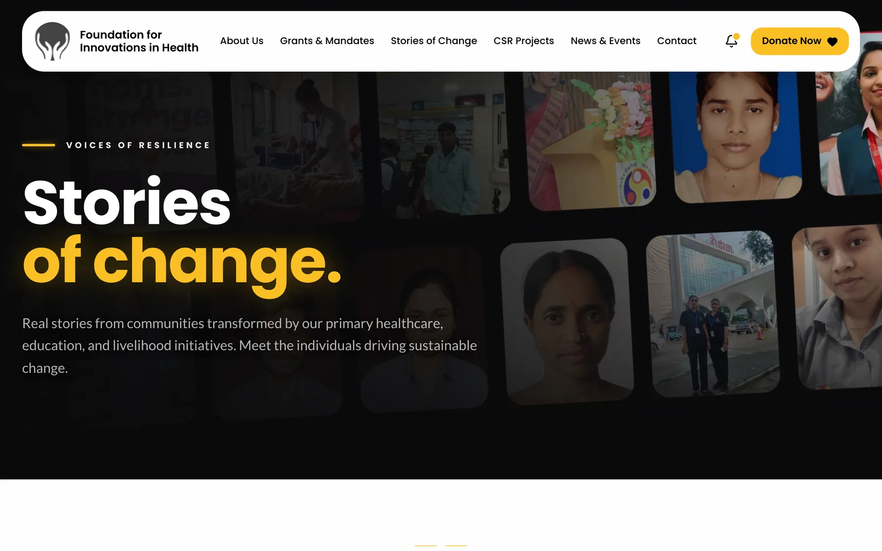
The same rule shaped Stories of Change. Real faces, real names, real jobs, laid out as a wall of portraits you can scroll through. It reads like a village, which is what it is.
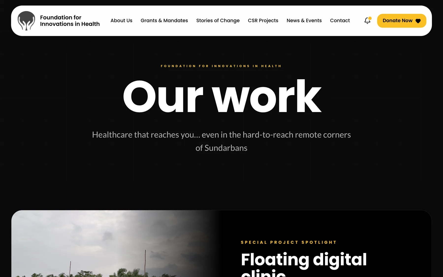
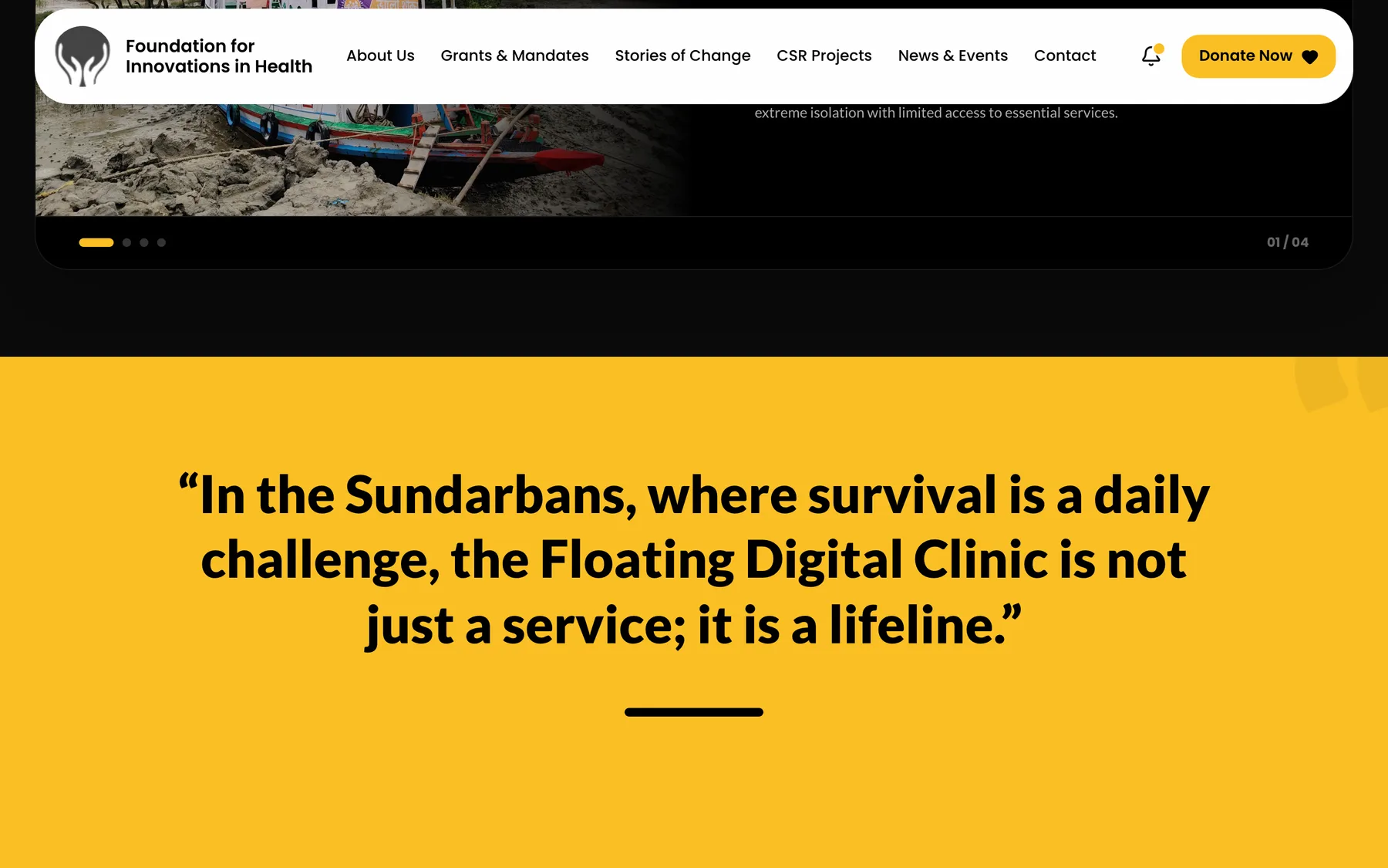
The FIH Our Work page opening on the floating digital clinic spotlight
Our Work opens on the boat, because the boat is the thing people remember
A full-width pull quote about the Floating Digital Clinic being a lifeline in the Sundarbans
A field quote given a full screen of its own, in the brand's amber
The Stories of Change page, a dark wall of portraits from FIH programmes
Stories of Change: portraits of people from the programmes, not stock imagery
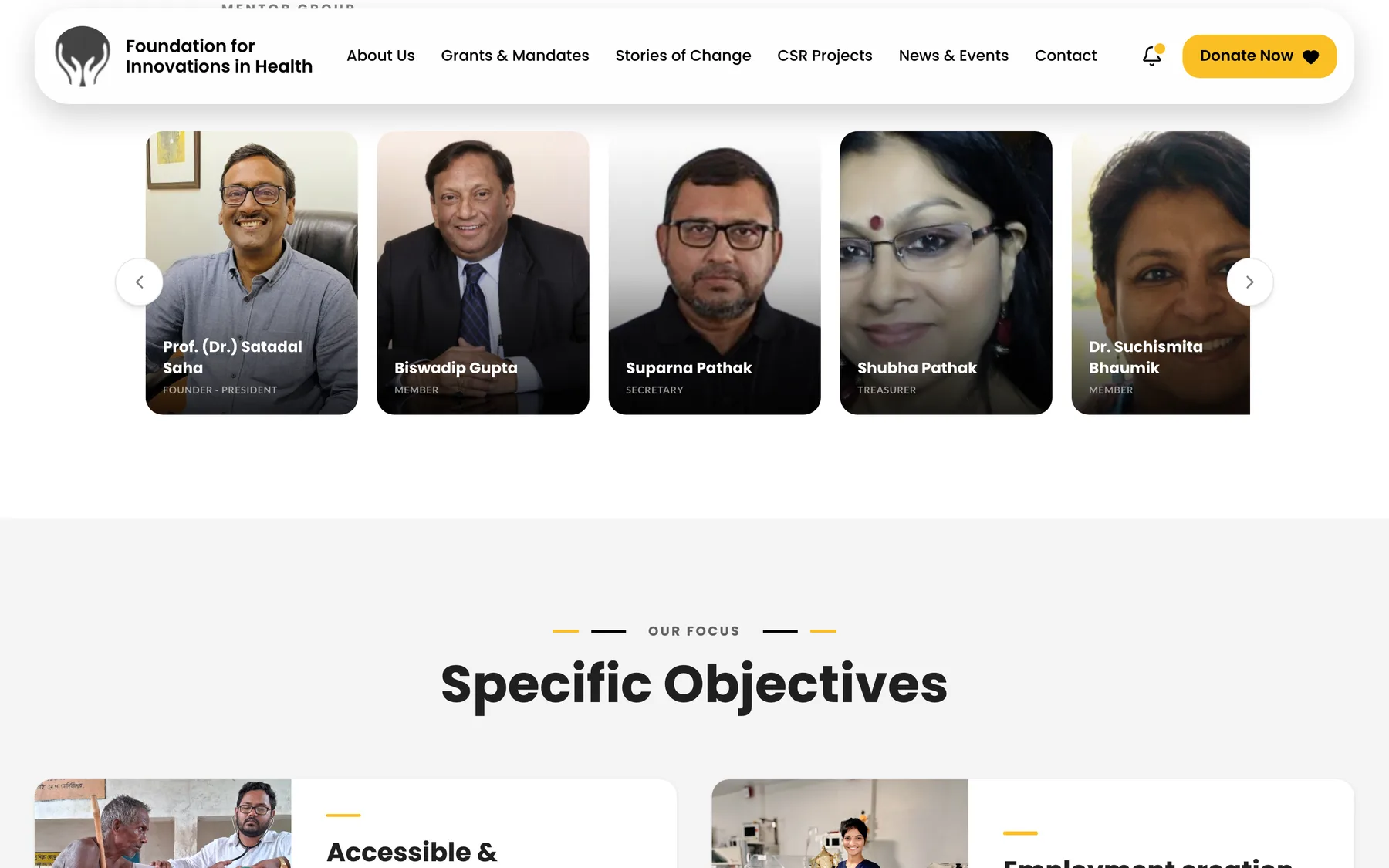
The FIH mentor group carousel showing named board members with their roles
The people behind the foundation, named and shown, which is what institutional partners look for first

Built to open fast

Performance

A lot of this site's audience is on a phone on a rural network. A page that takes six seconds does not get read, however good it is. So speed was a design constraint from day one, not a cleanup task at the end.

The site is a Next.js application on the App Router with Tailwind. It serves pre-rendered pages, modern image formats sized to their slot, and fonts that never block the first paint. Measured from a cold load on a desktop connection, here is where it lands.

0.3s

Server response

Time to first byte across the six main pages, measured cold.

0.6s

First paint

Typical first contentful paint on interior pages.

1s

Fully loaded

Most pages finish loading inside a second, images included.

6

Pages measured

Home, Our Work, About, Stories of Change, CSR Projects and Donate.

Measured with a headless Chrome run against the live site, cold cache, 1440px desktop viewport. Real-world timings on a rural mobile connection will be slower, which is exactly why the budget is this tight.

One kit, many pages

Design system

Everything on the site is built from a small set of parts. A new programme page can be made in an afternoon and still look like it belongs.

Amber is the only accent colour and it has one job: telling you where to act. Every donate button, every active state, every eyebrow label. Black carries structure, white carries reading. Poppins for headings, Lato for body text, both chosen for how they hold up at small sizes on a cheap screen.

  • Programme card. Image, label, title, one line, one button. Used for healthcare, education, projects and campaigns.
  • Spotlight band. A full-width photograph with a story panel beside it, for the boat clinic and other flagship projects.
  • Pull quote. A single amber screen with a field quote, used sparingly so it keeps its force.
  • Portrait wall. The layout behind both Stories of Change and the mentor group.
  • Notification bell. Live field updates from the CMS, with unread state remembered between visits.
Brand colours
Action Amber
1 #FBBF24
Structure Charcoal
2 #1A1A1A
Responsive

Made for a phone first

The mobile layout is not the desktop one squeezed. The headline breaks to fit the width it actually has, the menu collapses to a single button, the notification bell stays within reach of a thumb, and the two programme doors stack in the order they matter.

We set the type sizes by reading the site outdoors on a mid-range Android phone. That is closer to how it gets used than any lab test.
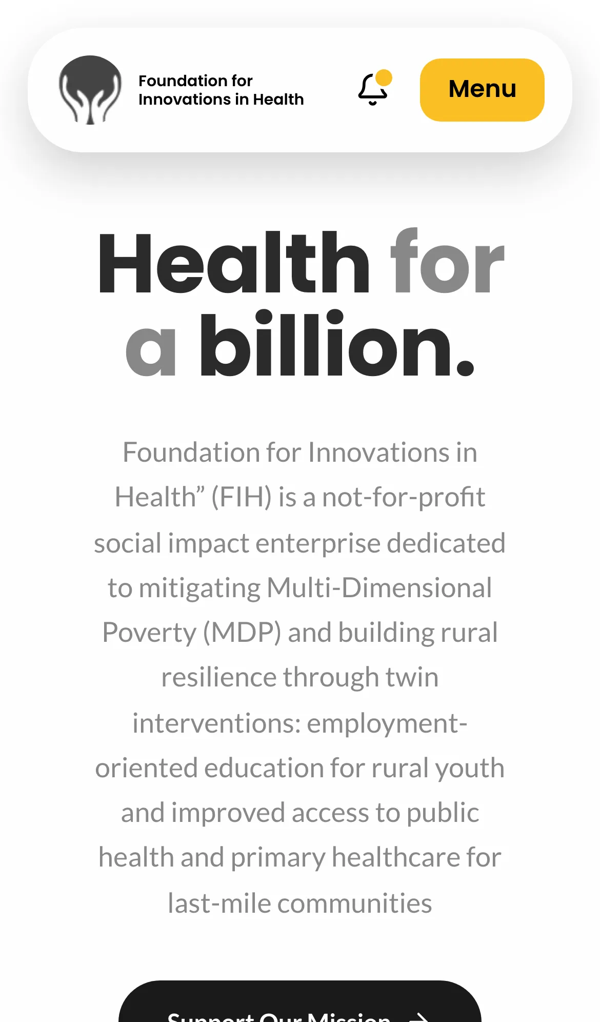
The FIH homepage on an iPhone, showing the collapsed navigation and stacked hero
The homepage on a phone

The team runs it now

Handover

The site is wired to Sanity, so field staff publish health camps, alerts and new stories themselves. Nobody has to file a ticket with a developer to announce a camp that is happening on Saturday.

That was the real deliverable. A website a non-profit needs a studio to update is a website that goes stale by the second month.

Published by the people who were there

Field teams post updates and photographs from their own phones, and the notification bell surfaces them across the site.

Trust made visible

Board members, academic partners, CSR funders and 80G status are all one click from the homepage, where partners look for them.

Fast enough for the last mile

Pages open in about a second on desktop and stay light on mobile data, which is where most of this audience actually is.

Project credits

Client

Foundation for Innovations in Health

Studio 1947

  • UI/UX Design Soumajit
  • Website Development & Engineering Santam

Time and place

Kolkata & Rural India, 2026

More work

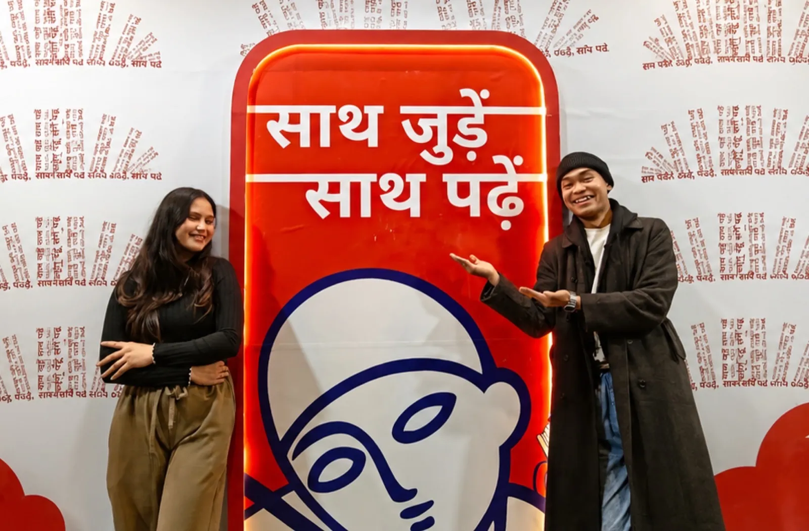
Rajkamal Prakashan event branding at a books and reading campaign
Digital InfraMarketingDesign

Rajkamal Prakashan

New DelhiSept, 2025

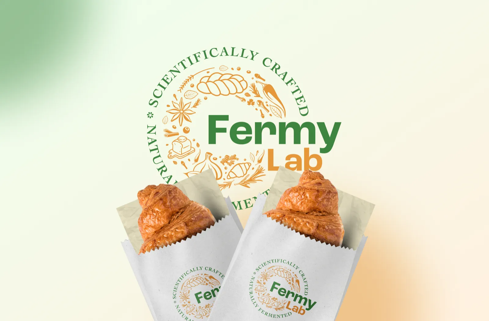
Fermy Lab naturally fermented bakery branding with croissant packaging
Web DesignBrandingMarketing

Fermy Lab

GurgaonJan, 2026

Nest Homes brand identity brochure, visiting cards, and collateral showcase
BrandingPrint Media

Nest Homes

Bengal & Himalayan Region2026

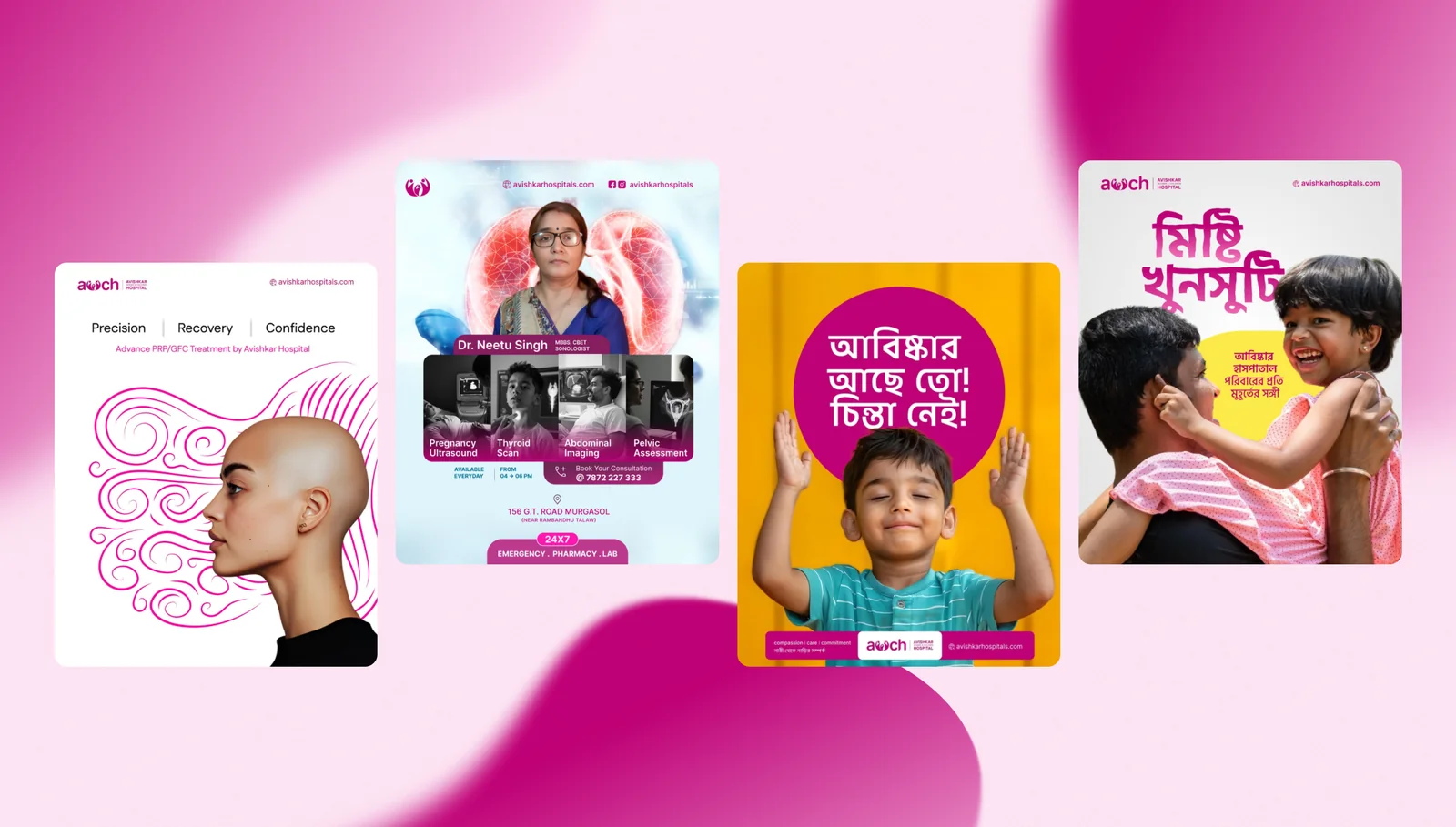
Avishkar Women & Children Hospital branding and campaign creatives
BrandingMarketingWebsite

Avishkar Hospital

AsansolApril, 2025

AIcrowd samurai mark surrounded by floating code and data icons
Science CommunicationDesign

AIcrowd

2025-2026

The Walking Project logo: white walking feet on a marigold yellow ground
Social Media CampaignWebsite Redesign

Walking Project

Mumbai, Maharashtra2026

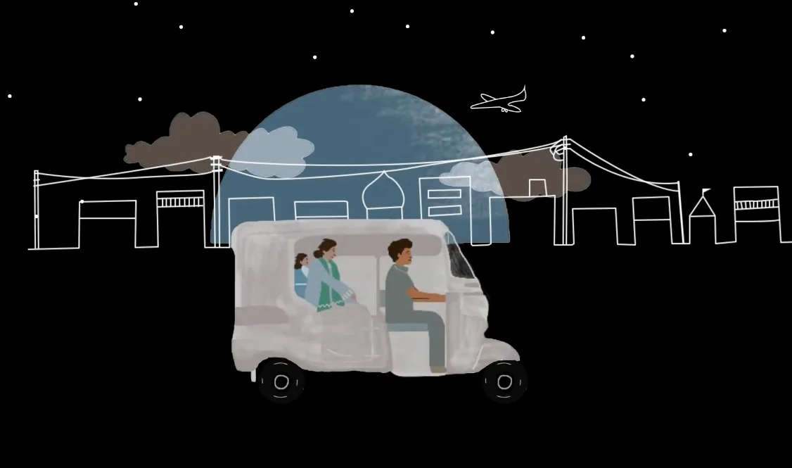
Local Futures animation still: an auto-rickshaw carrying a family through a line-drawn town at night, a blue moon behind
Video LocalisationSubtitling

Local Futures

London, UK & Global

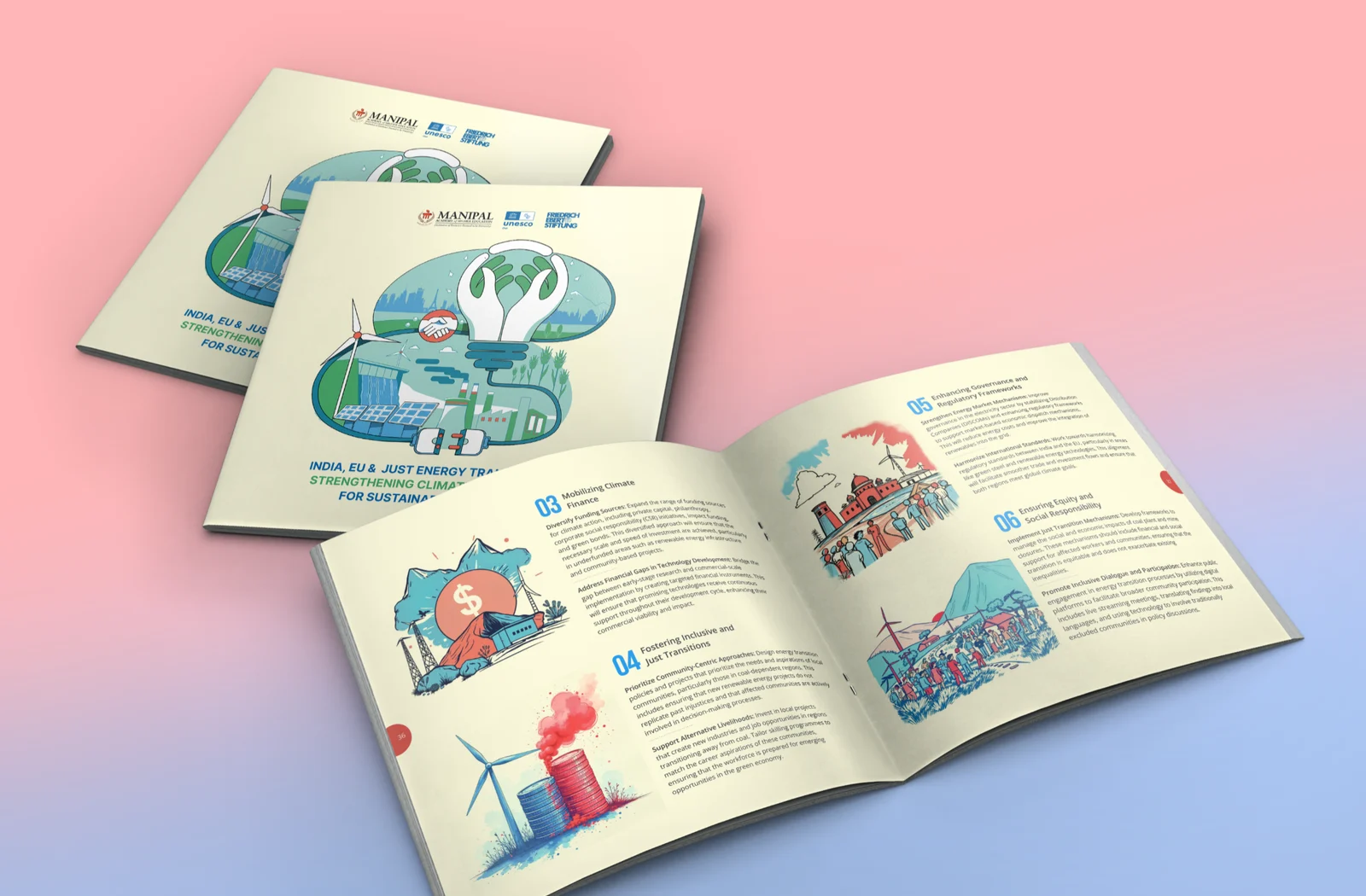
A Friedrich Ebert Stiftung booklet on India, the EU and just energy transitions, shown closed and open to an illustrated spread
Publication DesignInfographics

Friedrich Ebert Foundation

New Delhi2019-2025

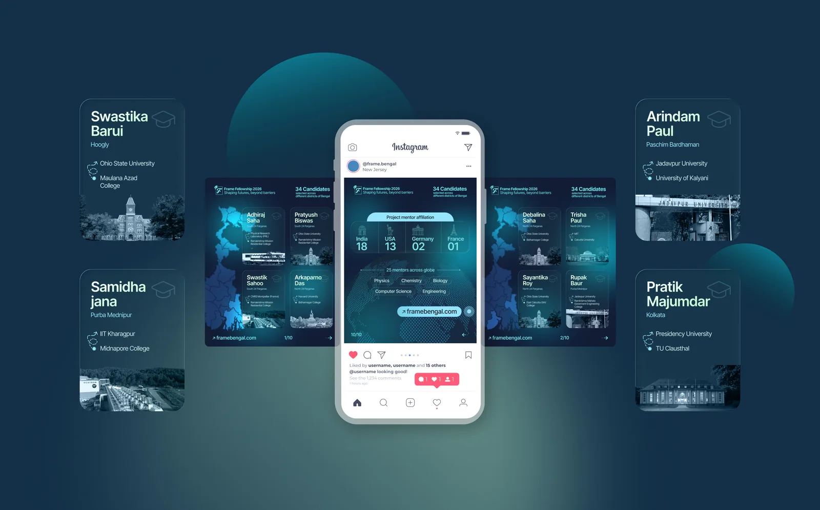
The Frame Fellowship 2026 campaign: Instagram carousel slides and candidate cards fanned around a phone, on deep teal
Data VisualisationPoster Design

Frame Bengal

West Bengal2026


A short walkthrough of the Jan Sahas Social Empowerment Society website, moving through its pages
Digital PlatformNGO WebsiteSocial Impact

Jan Sahas

Indore, Madhya Pradesh2026

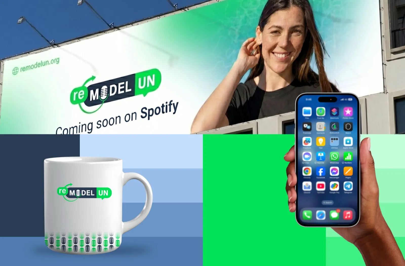
ReModel UN podcast brand rollout across billboard, mug and mobile app
LocalisationMarketingBranding

Remodel UN

GenevaJune, 2025

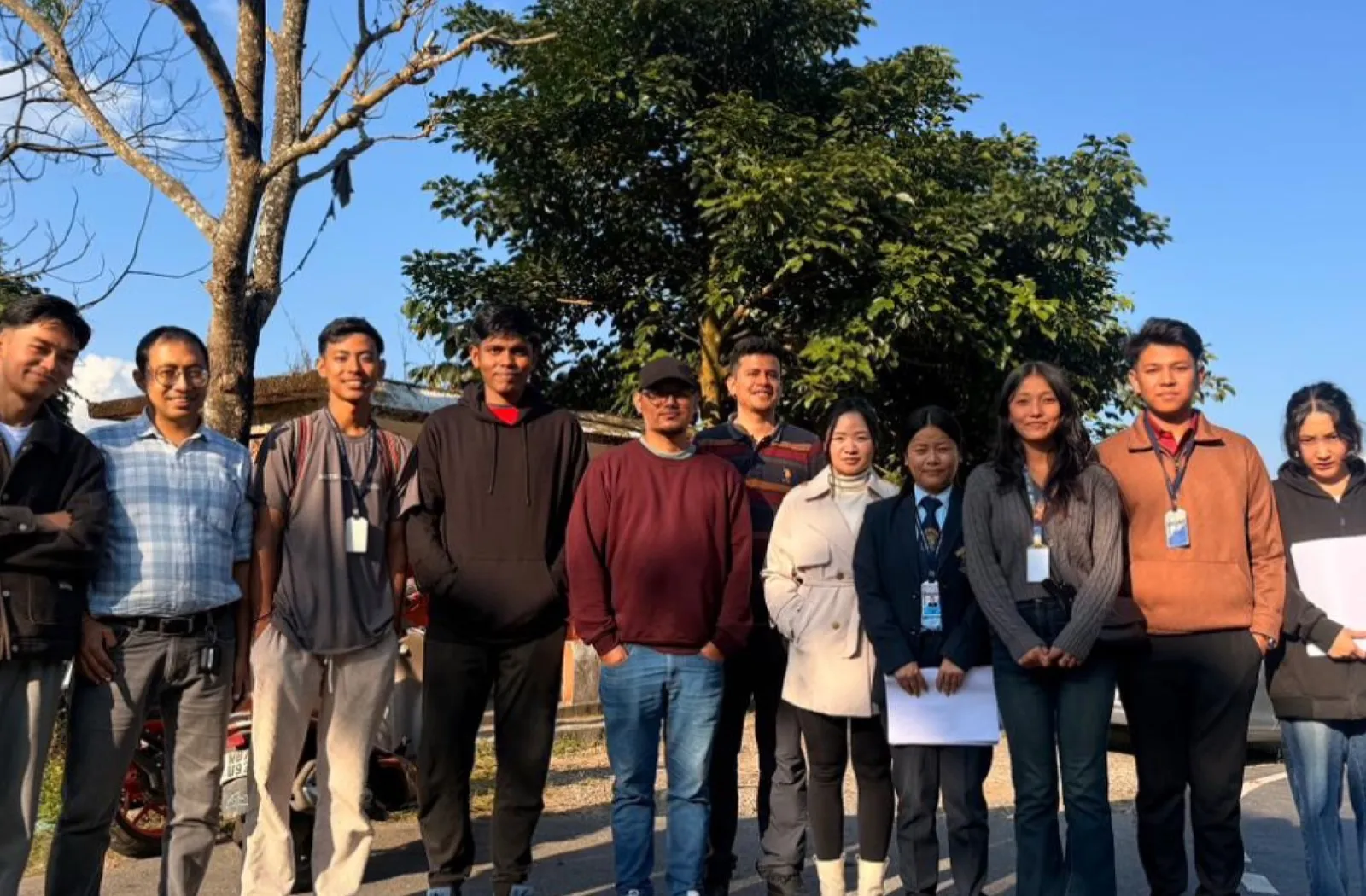
Studio 1947 field research team with students at Mirik College
ResearchSurveyCollaboration

Mirik College

MirikDec, 2025

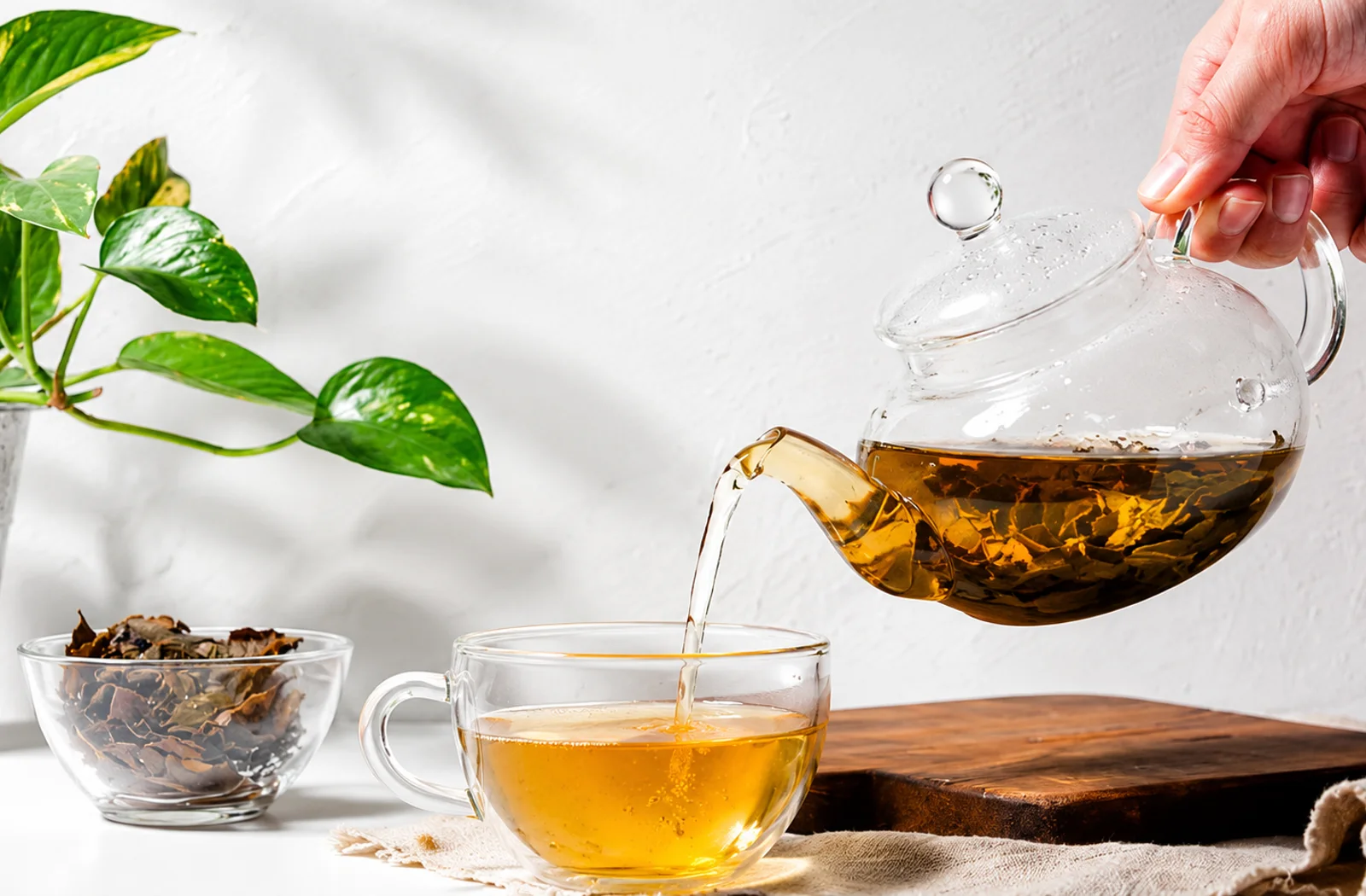
Darjeeling tea being poured from a glass teapot into a glass cup beside a bowl of dried leaves
DesignMarketingTechnology

Elegant Sip

Mirik, Darjeeling2026

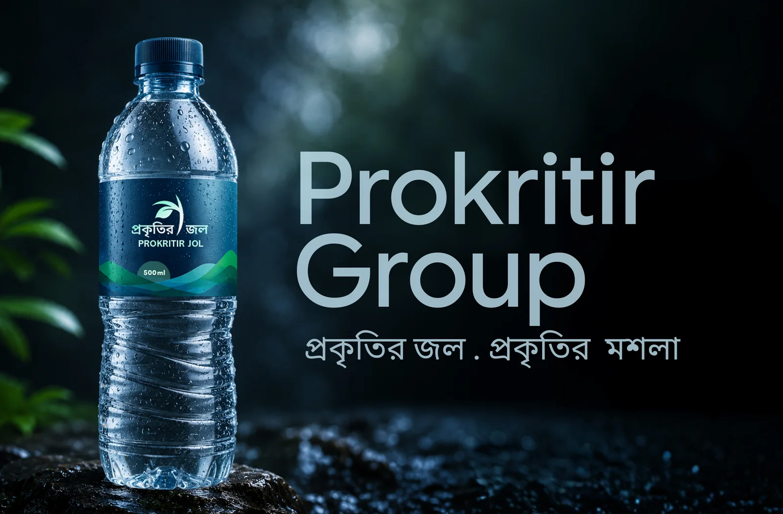
Prokritir Jol, a 500 ml bottle of packaged drinking water by Prokritir Group, on wet rock in a rain-dark forest
DesignMarketingTechnology

Prokritir Group

West Bengal2026

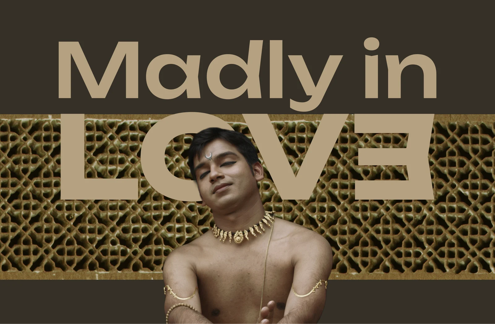
Madly in Love: promotional cover for a Bhagyam Arts programme, a dancer in gold jewellery against a carved jali screen
DesignMarketing

Bhagyam Arts & Aesthetic

New Delhi2025

Village Ways: community tourism brand and storytelling in the Sundarbans
BrandingContent Creation

Village Ways

SundarbanApril, 2026

Radha Madhav Medical Hall logo: a teal peacock-feather curl with saffron dots
Web/App DevelopmentDashboard

Radha Madhav Medical Hall

Mirik, Darjeeling2026

The Healix wordmark: a medical cross forming the H, in white, on brand purple
BrandingBrand IdentityPharmacy

Healix

Kolkata, India2026

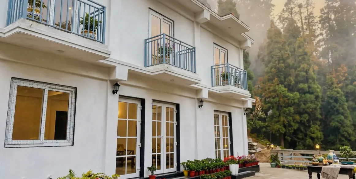
Kulam Homestay: the white two-storey homestay with blue balconies and potted flowers, pine forest behind
Web DesignOne-Pager SiteBranding

Kulam Homestay

Mirik, Darjeeling2026

Sikkim Himal Institute logo
DesignTechnology

Sikkim Himal Institute

Sikkim2026

Bhagirath Homestay in Mirik with its mountain-and-deer emblem
OTA ListingBranding

Bhagirath Homestay

Mirik, Darjeeling2025

Mohuna Media: Assam news channel branding and logo design
BrandingLogo DesignBusiness Cards

Mohuna Media

Assam, India2026

View all work