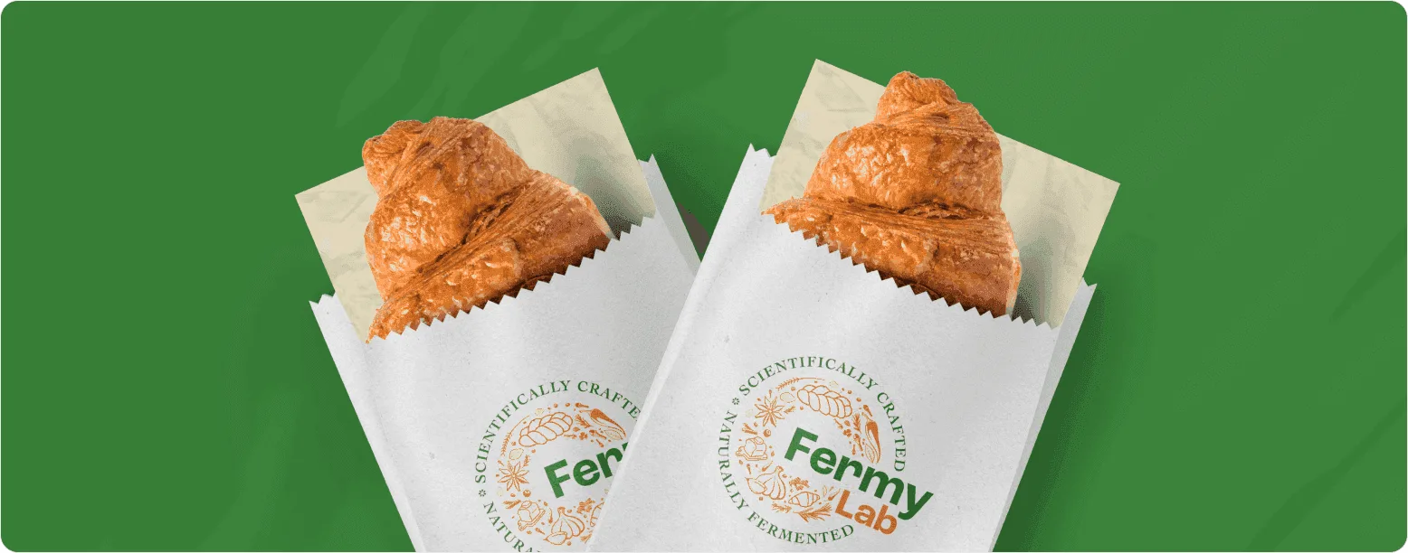
Fermy Lab
When food founders and consumer brands look for a creative agency, they aren't just after attractive graphics. They want a working commercial system: one that earns trust on a grocery shelf, gets noticed on delivery apps, and adapts smoothly as the company grows.
This case study shows how we turned the founding values of Fermy Lab into a polished, scalable identity system built for real business growth.
Context & The Challenge
The MissionFermy Lab is a food brand that makes premium products using slow, natural fermentation. It joins traditional Indian cooking wisdom with proven techniques from cultures around the world. The aim is food that is healthy, enjoyable and kind to the environment, with no artificial preservation shortcuts.
The brand sits at a crossroads: deep tradition and modern thinking, local roots and global ideas, natural patience and scientific rigour. To express that balance, we anchored the branding in the idea of “calm confidence”. The style is clean and systematic, yet warm and handcrafted. It shows customers that slow food can be professional, clean and world-class.
Parent-Brand Architecture
To save the client design costs later, we built a "parent-child" visual system with room to grow:
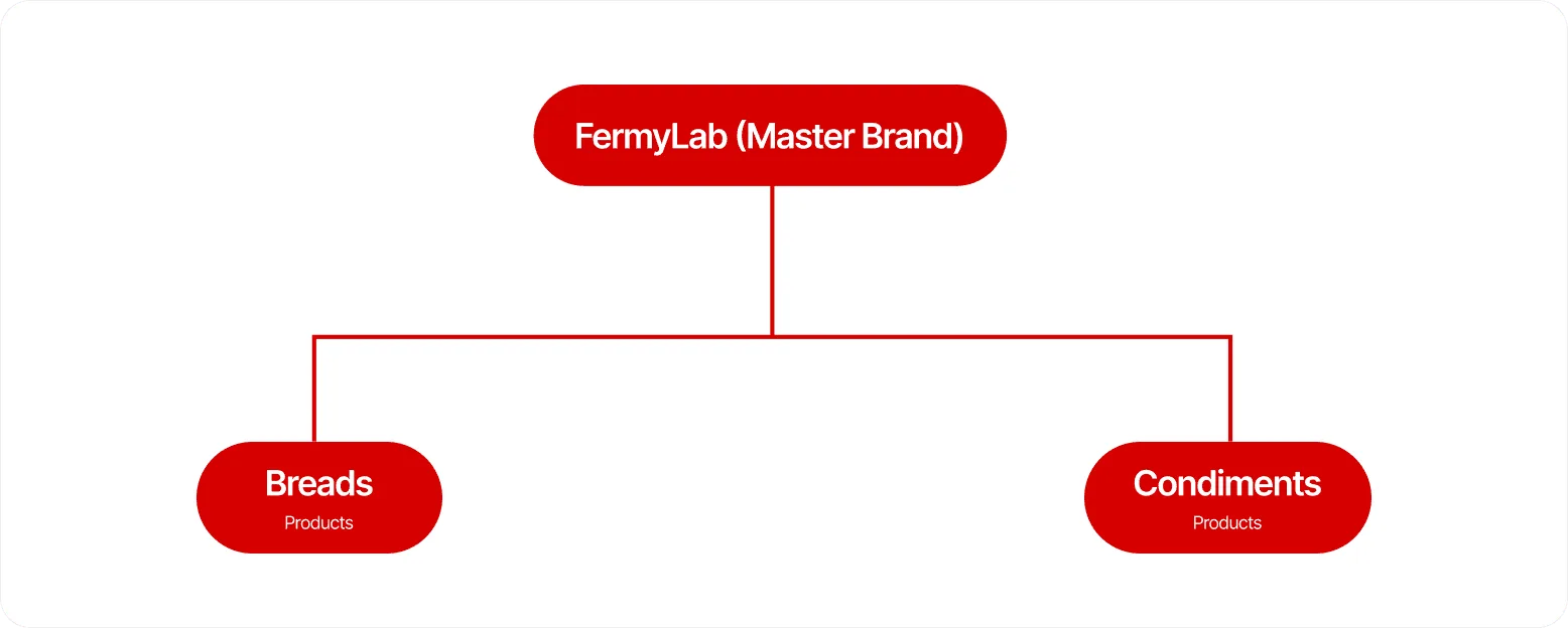
Fermy Lab is the master identity. Under it, the brand launches with two product tracks: Breads and Condiments. Each item carries its own product line labelling, while the master mark stays prominent across everything. So the business can launch new items straight away without paying for a full brand redesign.
Color & Typography Systems
The PaletteThe colour identity uses a high-contrast pairing made to stand out on store shelves:
Space Grotesk
Usage
Headlines, packaging titles and technical system signage.
The Strategy
Space Grotesk brings a clean, disciplined geometric frame that echoes the “Lab” in the brand name. It stays sharp on printed packaging and on screens. And because it is free in the open-source Google Fonts library, marketing teams anywhere can build matching assets without licensing trouble.
Just Sans
Usage
Brand stories, back-of-label explanations and detailed ingredient lists.
The Strategy
To balance the technical look of the primary font, we paired it with Just Sans. It adds a friendly, modernist warmth and clear geometric shapes. Health labels and brand stories stay approachable and easy for customers to scan.
The Logo Usage & Visual Governance
To keep the logo consistent across very different labels and screens, we gathered every configuration, safety guideline and prohibition into a single technical standard.
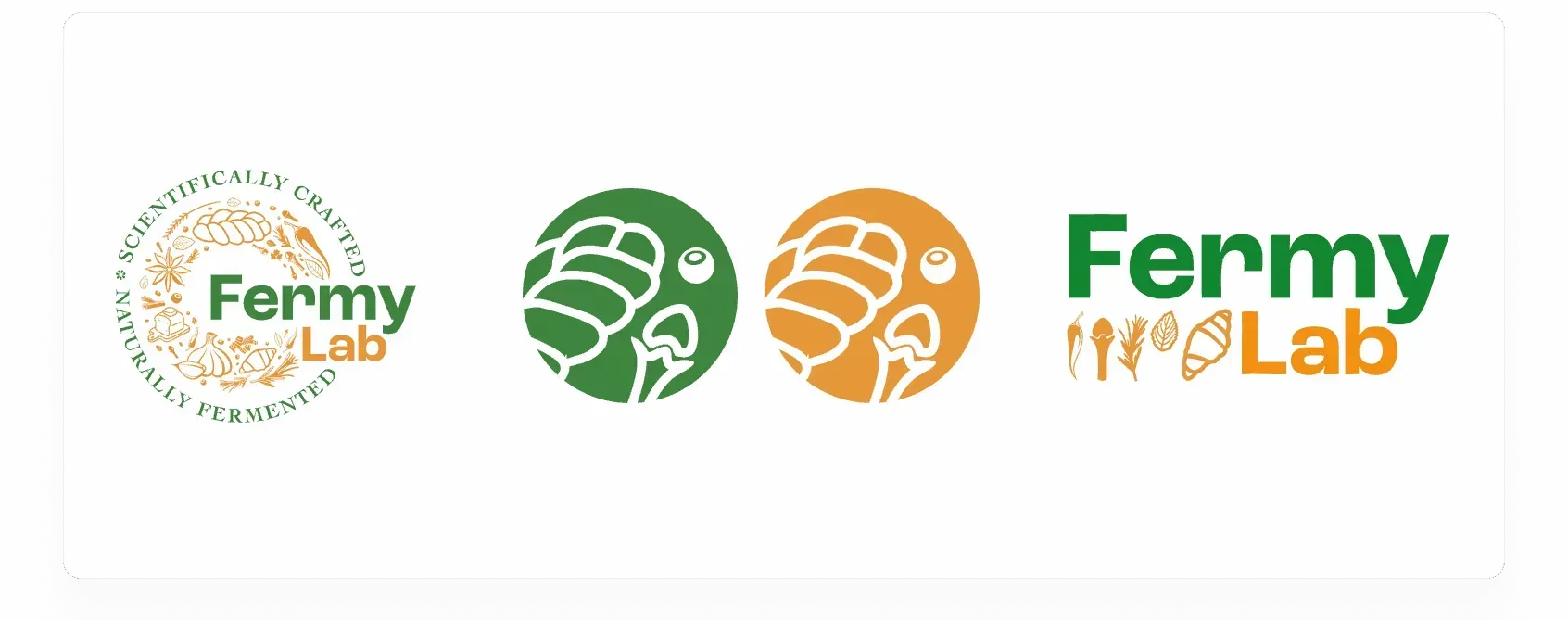
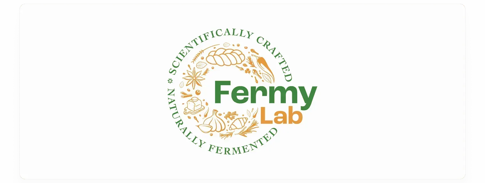
This is the main seal of quality. It brings the brand name, core ingredients and service taglines together in a circular stamp. An illustrated wreath shows real ingredients: twisted challah bread, garlic bulbs, star anise, cloves and chillies.
Made for tight spaces where the logo still needs to be seen. This inline version sets the wordmark directly above a simple row of ingredient icons.

Simple, high-contrast circular badges that pick out a single icon, such as the mini bread loaf or a clove. They keep the identity sharp on tiny screens.

So the master mark is never crowded by copy or layout edges, it always gets a minimum safety border. That breathing room is exactly one "1 Challah distance", taken from the height of the twisted bread illustration inside the badge.
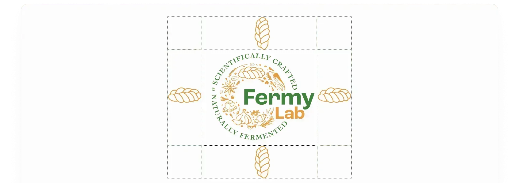
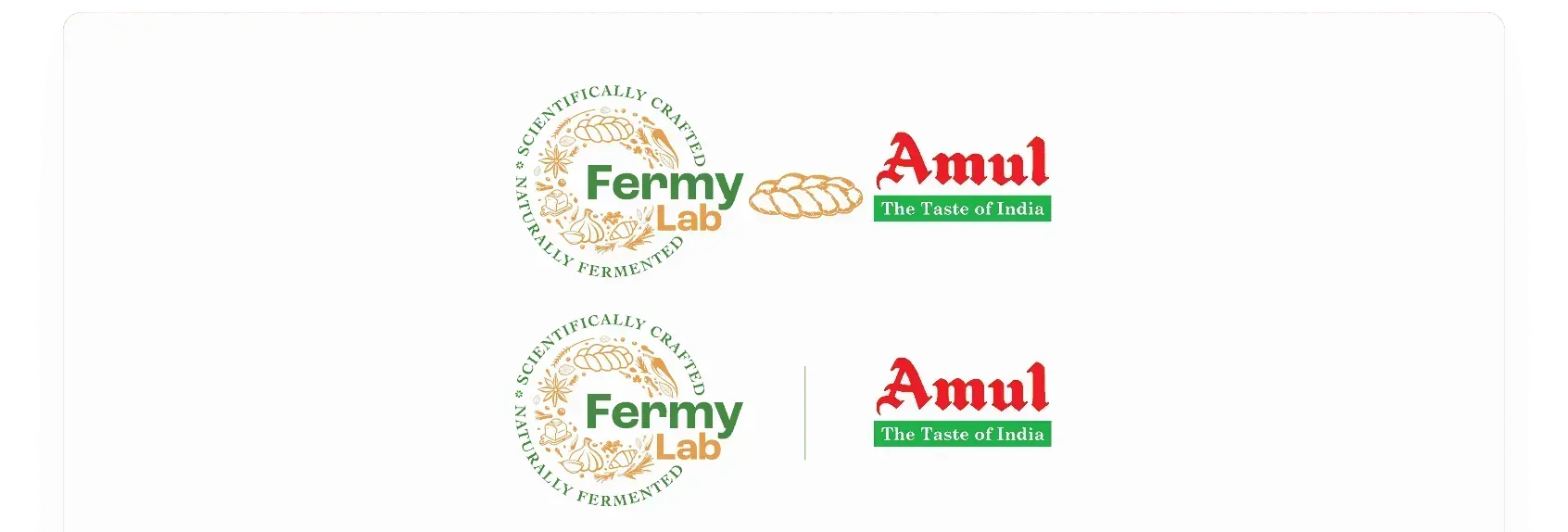
When the logo sits next to distribution partners or established institutions (for example, a historic name like Amul), the system keeps a strict 1-Challah safety margin to protect FermyLab's own authority.
The FermyLab logo isn't just a symbol, it's a statement. Keep it clear, crisp, and confidently placed.
Absolute Production Prohibitions
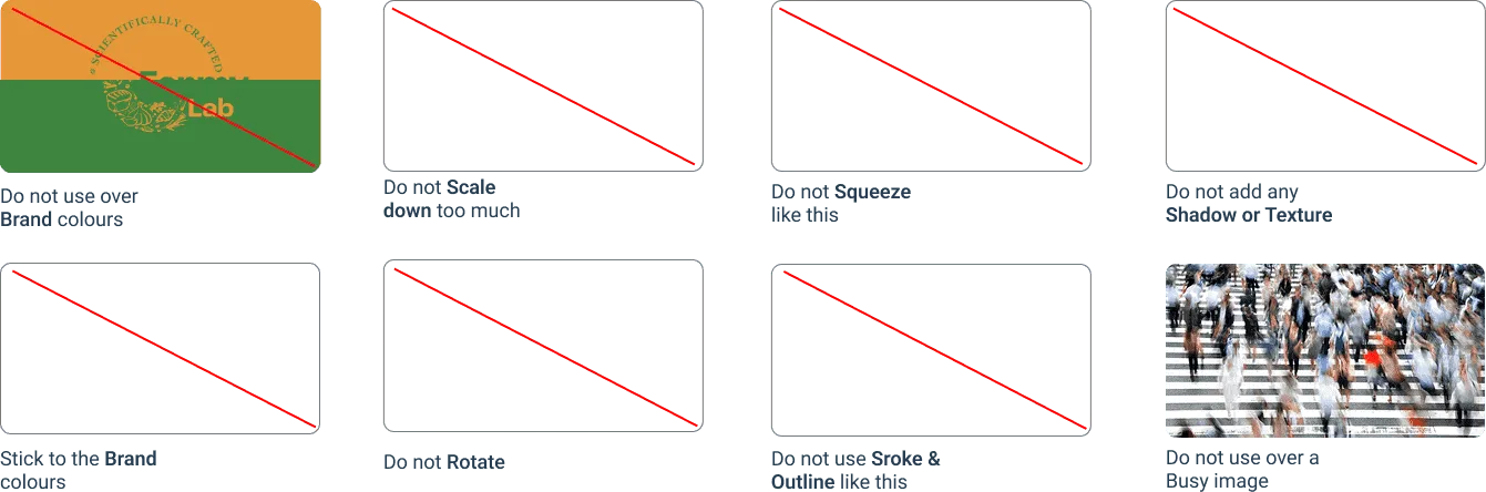
To remove any guesswork for printers or developers, we wrote a clear checklist of what not to do. Production must never make the following changes:
Putting the System to Work
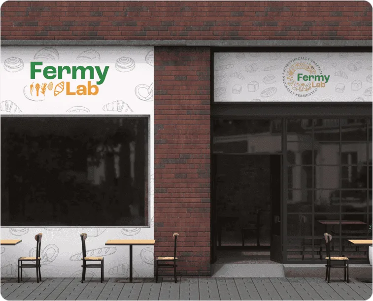
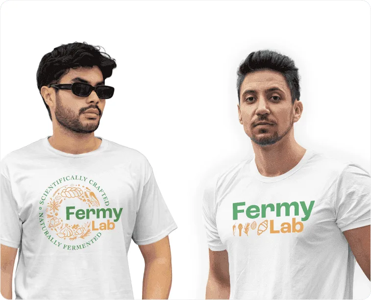
To show how the identity wins customers in physical shops and on digital platforms, we applied the brand assets across the key commercial touchpoints
Clean badge labels wrap neatly around slow-aged condiment jars. The result is elegant and editorial, and it stands out on a busy retail shelf.
Clean badge labels wrap neatly around slow-aged condiment jars. The result is elegant and editorial, and it stands out on a busy retail shelf.
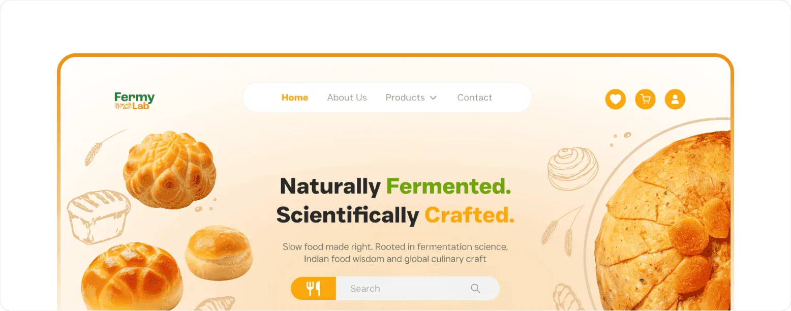
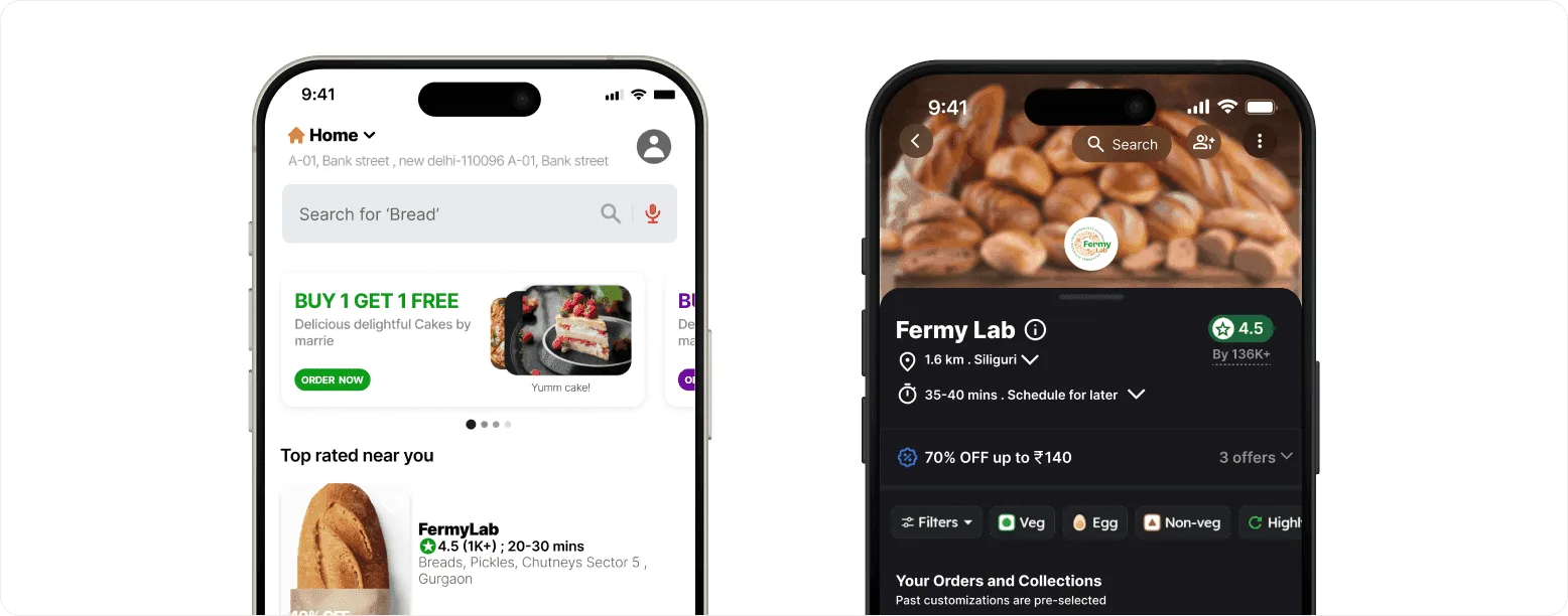
We tuned the brand assets for dark-mode delivery apps on phones. When a customer is scrolling quickly through restaurant options, FermyLab's product cards, details and icons stay crisp and readable.
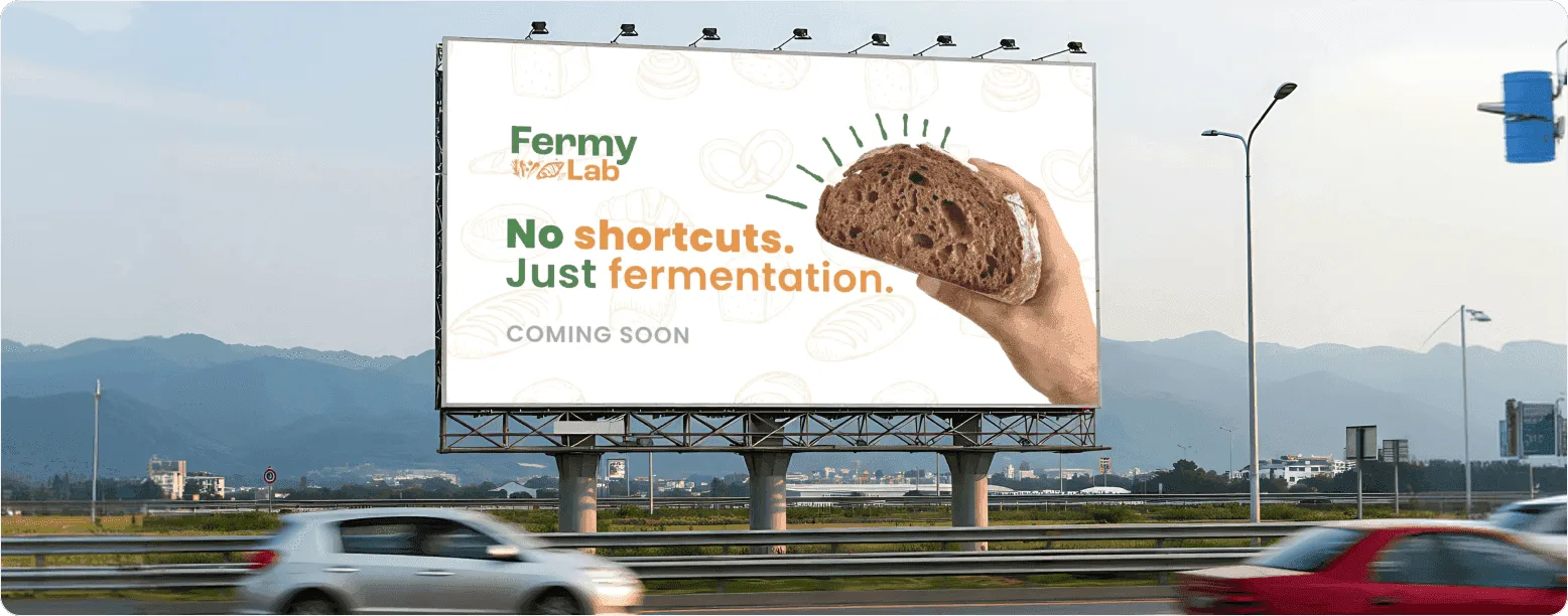
Big highway billboards pair huge food photography with a few words ("No shortcuts. Just fermentation.") to build mainstream awareness fast.
Commercial Value Summary
Instead of a loose set of graphic files, we gave Fermy Lab a disciplined, complete brand toolkit. The business is ready to stand out on shelves, look sharp on screens, and launch new sub-brands with confidence and no added design debt.
Project credits
Client
Fermy Lab
Studio 1947
Time and place
Gurgaon, Jan, 2026
Viewed 0 times
More work
Rajkamal Prakashan
Nest Homes
Avishkar Hospital
AIcrowd

Walking Project

Local Futures
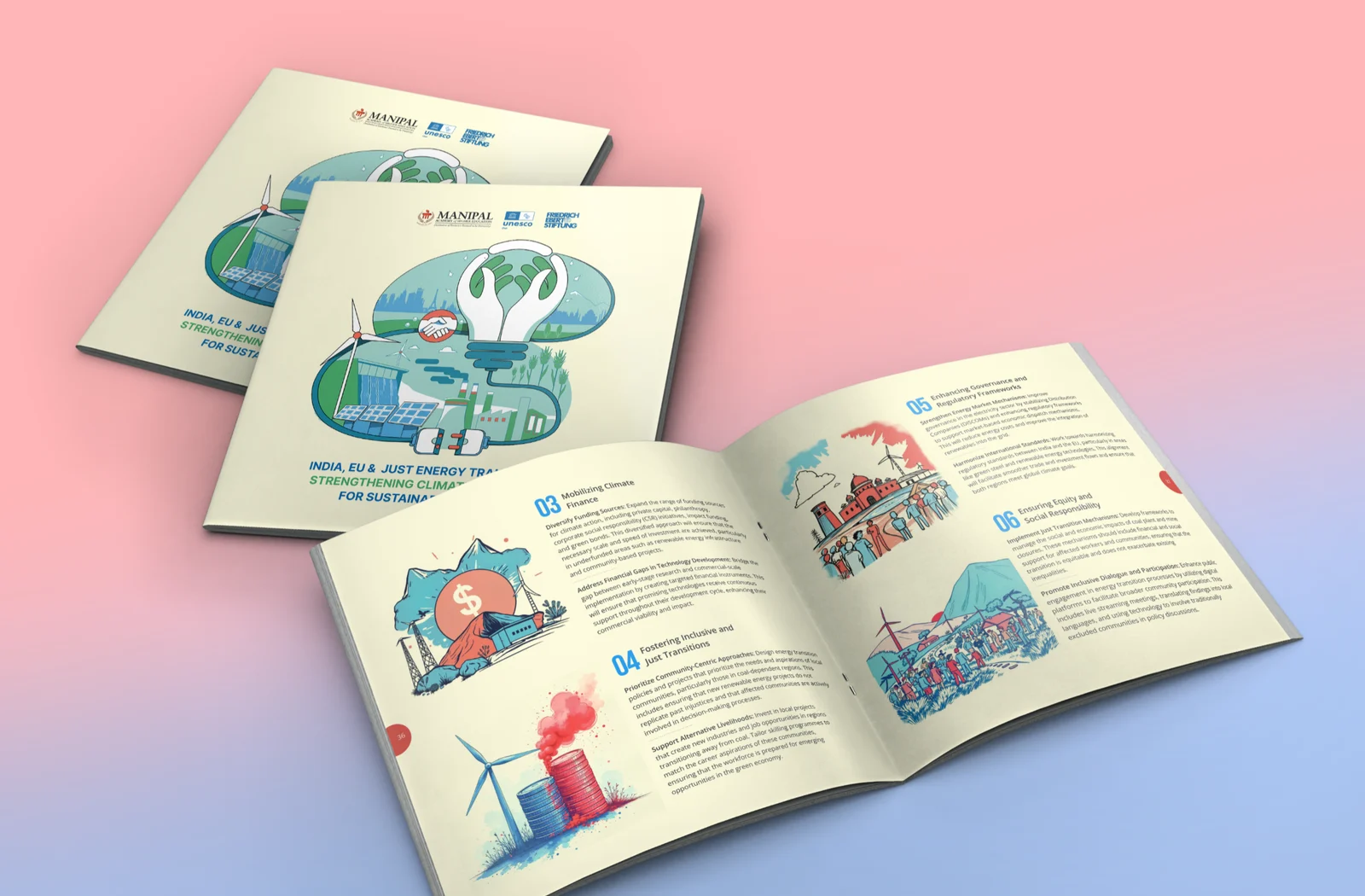
Friedrich Ebert Foundation
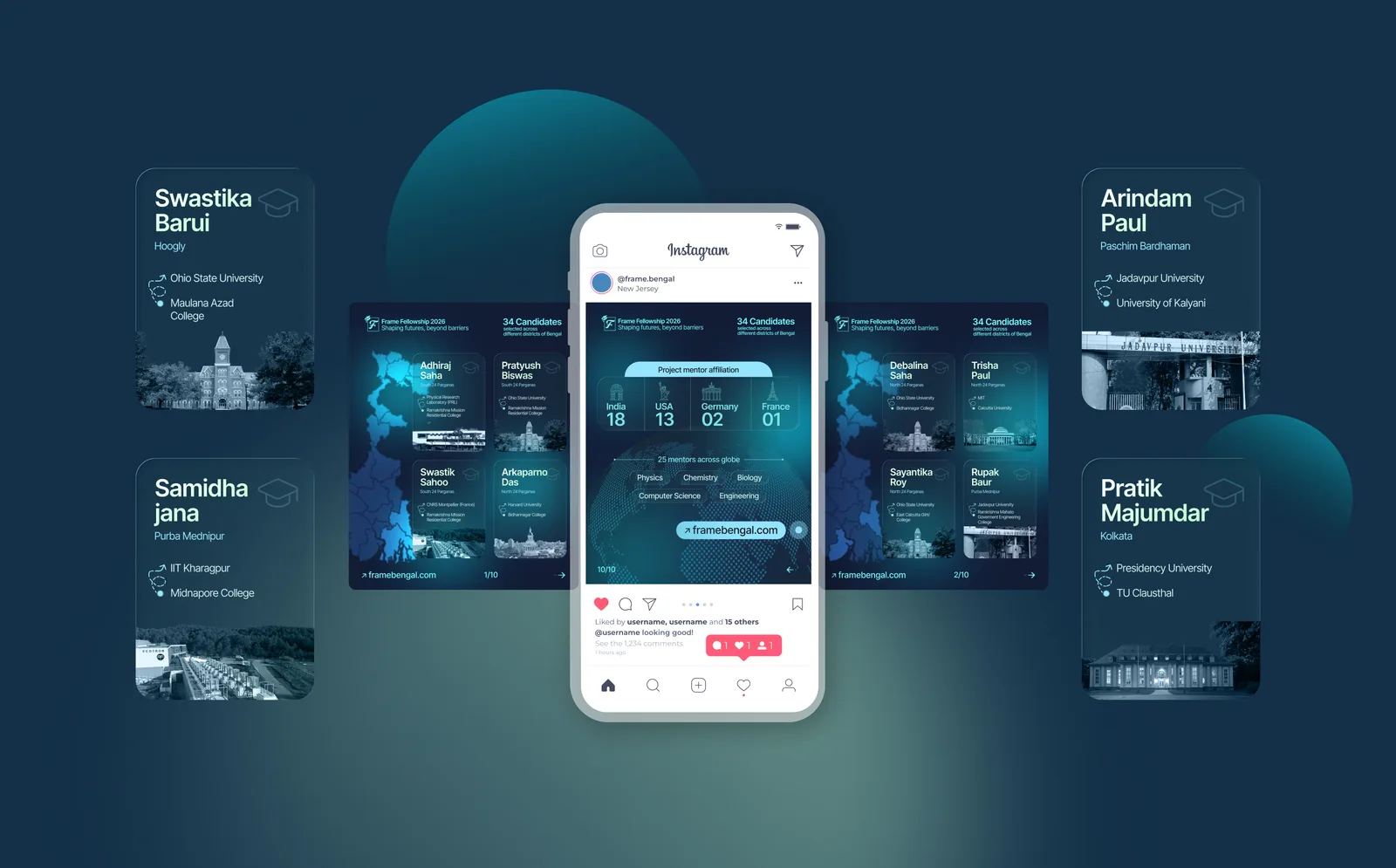
Frame Bengal

Jan Sahas
FIH Website Redesign
Remodel UN

Mirik College

Elegant Sip

Prokritir Group

Bhagyam Arts & Aesthetic
Village Ways
Radha Madhav Medical Hall
Healix

Kulam Homestay

Sikkim Himal Institute

Bhagirath Homestay