English
Blog 1 : Matched or Mismatched! Product & Emotions
Sep 8, 2024
Back to blogs
What Dating Apps Teach Us About Designing for Fear and Connection
It starts with a swipe. A small, simple gesture that carries so much weight.
As a product designer, I’ve always been fascinated by how something as basic as a swipe can drive behavior, spark emotions, and create an entirely new way to connect or disconnect.
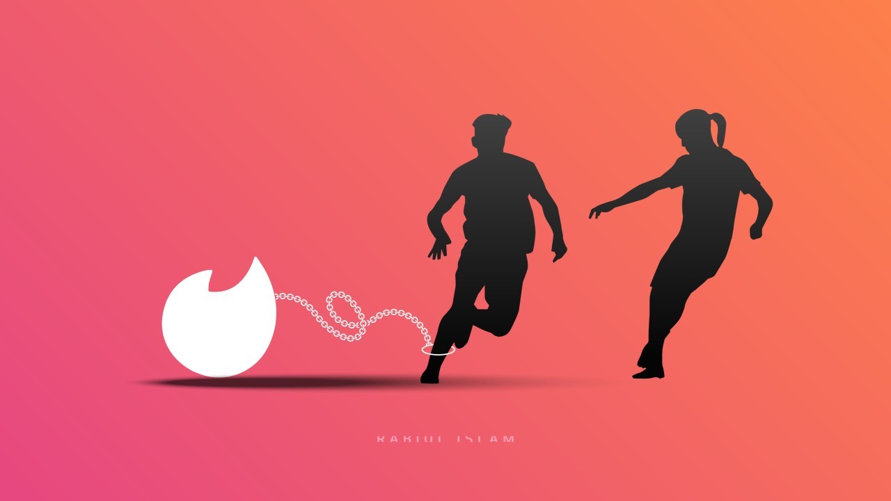
Dating apps are, at their core, a marvel of design simplicity. But what lies beneath the interface? A human mind, often battling two invisible forces: fear of ignorance and fear of rejection.
Let me tell you a story. Rather a common story.
Last year, a friend of mine downloaded a popular dating app. She was excited—new faces, fresh conversations, endless possibilities. She swiped, matched, chatted. For a while, it felt like the world had opened up.
But soon, she found herself stuck in a loop.
She couldn’t commit to a conversation because she feared there might be someone better out there. The more options the app presented, the harder it became for her to choose. Her joy turned into anxiety; a textbook example of the Paradox of Choice.
When she did invest in a match, ghosting or rejection felt personal. Every unresponded message chipped away at her confidence. The app, which initially seemed like a gateway to connection, had turned into a mirror reflecting her deepest insecurities.
That’s when it hit me: the problem isn’t just emotional; it’s structural.
What Designers Can Learn from Dating Apps
Dating apps aren’t inherently bad. They’re beautifully designed to function exactly as intended. But their mechanics unintentionally amplify two psychological traps:
The Fear of Ignorance (Abundance Overload)
The Fear of Rejection (Metrics as Identity)
Designing for Connection, Not Crisis
Here’s where we, as designers, have a responsibility. Dating apps are more than tools; they’re environments where people navigate their vulnerabilities.
What if we designed with this in mind?
Reduce Overload: Limit options to encourage deeper exploration of matches, rather than endless swiping.
Shift Focus: Prioritize meaningful conversations over metrics like match counts.
Foster Authenticity: Introduce features that guide users toward self-reflection and connection rather than superficial interaction.
A Reminder for All of Us
Dating apps are just one example of how product design shapes human behavior. They reveal the fine line between functionality and psychology; how good design can empower but also overwhelm.
So the next time you’re designing a product, ask yourself:
Are we solving problems or creating new ones?
Are we designing for convenience or connection?
Because in the end, whether it’s a swipe, a tap, or a scroll, our job as designers is to match people with meaning; not just features.
What’s your take? Can better design help us overcome fear and create deeper connections? Feel free to share your thoughts in comments.

written by
Rabi
